
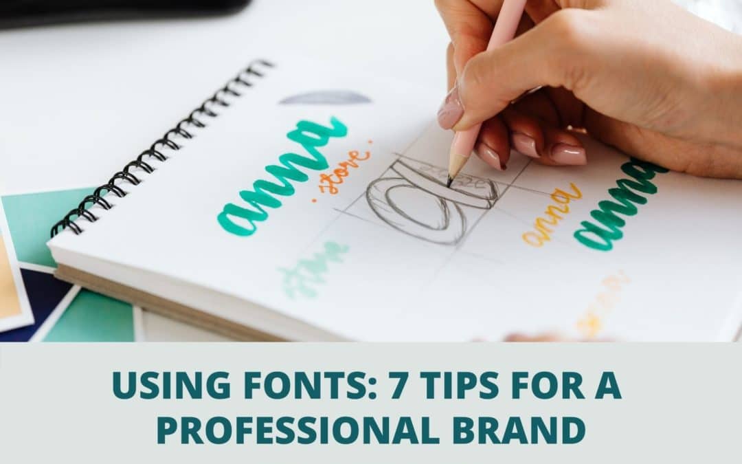
Brand Fabulously Using Fonts!
")
Use fonts intentionally to build credibility and move people to action.
Get your Design Tips for Using Fonts, with examples, below!
Using fonts incorrectly presents your brand with an amateur-feel that bruises your brand’s professional look. People don’t buy from companies they don’t trust and poor design chips away at your credibility.
Every brand needs its own font and supportive font families. Make sure your design team is maintaining brand consistency and not straying from your brand’s style guide with different fonts everywhere, from the web to print.
Using Your Brand’s Fonts in Print
When you need printed marketing collateral—whether a direct mail piece or a high-end brochure—you will want it to move people to action.
The process of creating compelling marketing collateral involves decisions throughout the project. A solid plan will yield better results. Some of the things you will work through include having a clear purpose and objective, messaging, call to action, fonts and size, images, paper stock, size, color palette, and coatings. One rule we always follow: Think finishing at the beginning.
Have you ever gone through this process, received your printed materials, and been disappointed with less than par results? If a re-do is not in your marketing budget or deadline, you’re left having to distribute the materials regardless.
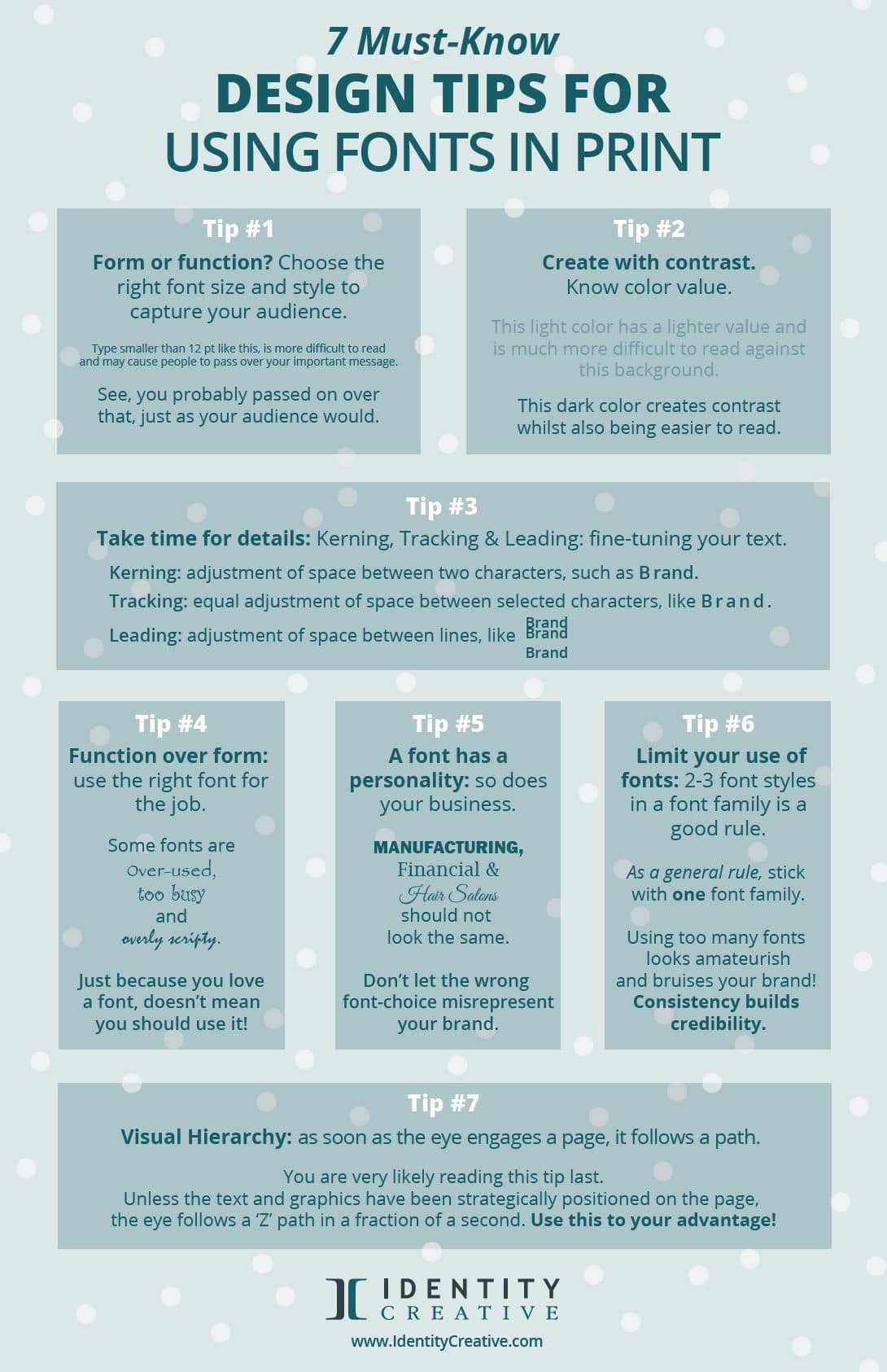
There are a lot of boxes to tick in the planning and design of a printed piece. Today we’re covering our top 7 must-know design tips for using fonts in print.
Here are 7 Must-Know Design Tips with Fonts.
#1 Be aware of the size of your fonts.
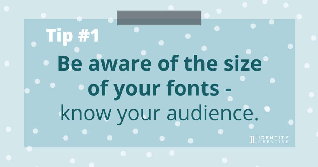 Will your audience see it? Is your audience over 40 years old? Don’t go much smaller than 12 point if this is your reader. Vision quality changes as we age, and the people receiving your print materials may not take the time to find their glasses to read your mailer or brochure.
People have too much to look at already. We are kidding ourselves if we think that they’re going to strain to read a marketing message!
Sidebar rant on billboards: We’re noticing more small print on billboards. A billboard needs a readable message in one second. How will they read the small copy when driving on the highway?
Billboards with discreet type and a small logo are not discernable to drivers: they will fail at attracting customers. Graphic design for business always has a goal: keep that goal in mind throughout the design process. Stay focused on the purpose of the design, how it will serve the goal, and move people to action.
#2 Understand the contrast of color.
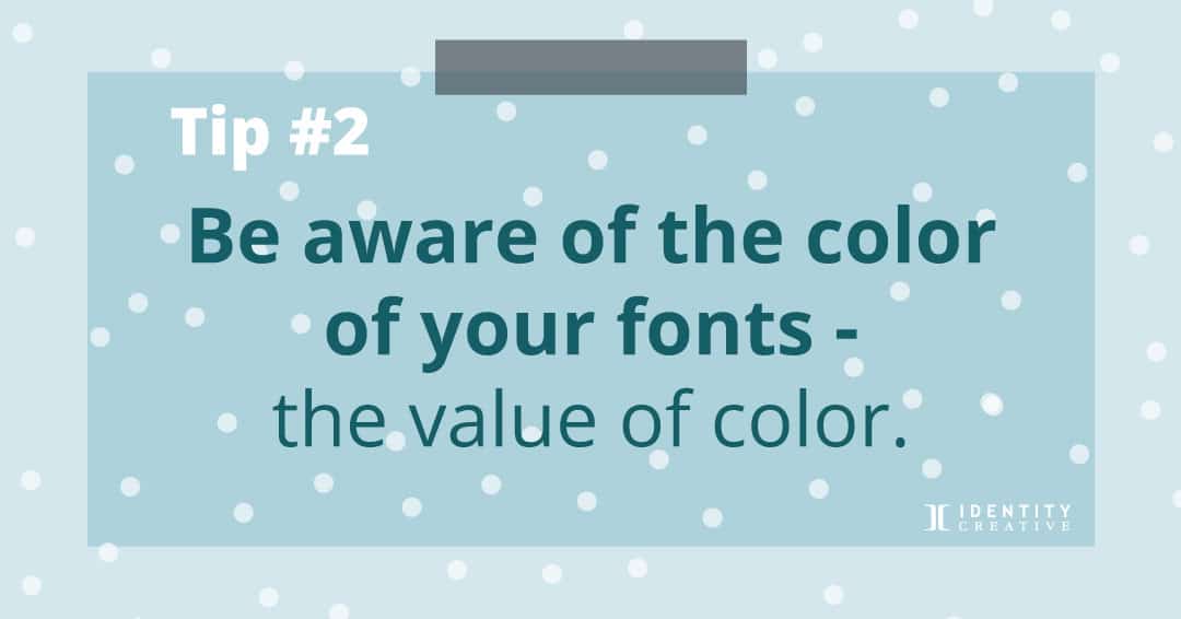 Color Lives on a Value Scale. Yellow has a lighter value than blue. Yellow type on a white background won’t grab attention as well as blue. The human eye detects warm colors before cool colors.
Take into account the value scale of your copy versus the color value of your background. For example, white or lighter-value text on any light color or photo will be more challenging to see, which brings us to our next point.
Contrast is critical
Here’s a trick when dealing with color on a value scale, squint your eyes, and if you can’t make out the words, consider lightening or darkening either your background or your copy.
“The beauty of type lies in its utility; prettiness without readability serves neither author nor reader”
– James Felici
#3 Limit your use of fonts
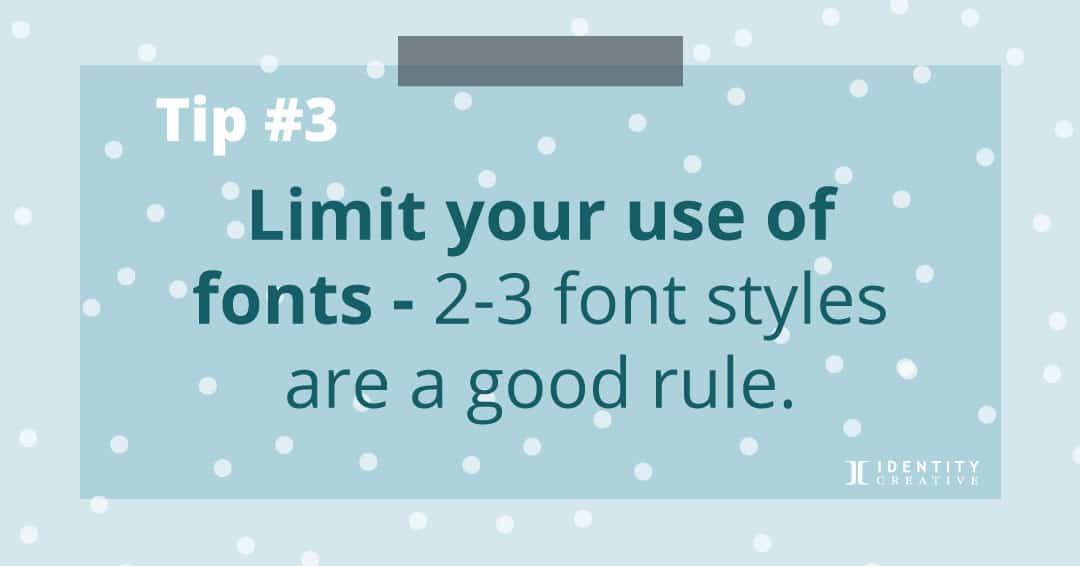 Two to three font styles are a good rule.
The font style helps set the tone of your piece. Using too many fonts will clutter your piece. The overuse of font styles also tends to look amateurish. As a rule, stick with one font family and take advantage of the alternatives within that font family.
Beware of Designer A.D.D.! Don’t get bored with your brand’s fonts and change them on a whim. Your brand has a style, and the font is an important design element that communicates the personality (see #5). Consistency builds credibility and recognition for your brand.
#4 Consider your font style
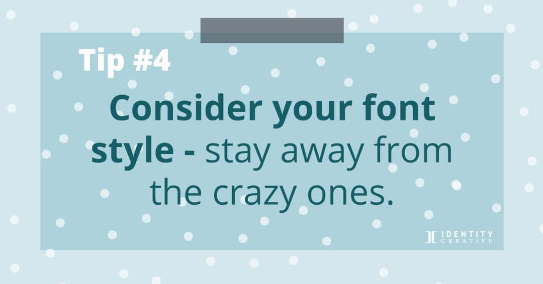 Stay away from crazy fonts unless it’s the perfect fit.
Fonts with an extreme style call attention to themselves. You know when you see them, curly-swirly fonts and difficult-to-read script. Use them with great care. When it comes down to readability, stick to serif and sans serif fonts.
Limit your use of cursive or calligraphic fonts in print. If you do use them, make sure they are readable. Don’t mistake emphasizing form over function if you want a marketing piece that will get results.
Functions for fonts
Specific fonts serve well as title or header fonts and others as body copy. A title in all uppercase can be effective, but all caps appear loud for body copy.
Your audience will struggle to read text that is presented in all caps. (Perhaps that is why legal documents use it!)
If you need to show emphasis, do it creatively, not shouting with your text.
You know when you see them, curly-swirly fonts and difficult-to-read script. These fun fonts are great in limited contexts, but when it comes down to readability, stick to serif and sans serif fonts.
Limit your use of cursive or calligraphic fonts in print. If you do use them make sure they are readable. If you want a marketing piece that will help get results, don’t emphasize form over function.
#5 Fonts have personalities
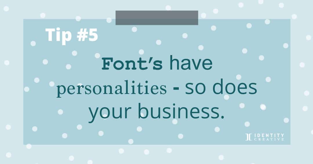 Your business has a personality, too.
Don’t let a font style misrepresent the personality of your business. Keep it consistent and relevant to your brand’s style or standards guide.
For example, serif fonts in print tend to promote a more traditional or sophisticated demeanor, while sans serif fonts can create a more contemporary feel for your business.
Both can be used in the same piece if you assign one for a header function and one for the copy section. The contrast of the two will create a solid impression when carried out effectively.
If you haven’t yet identified a family of fonts that match your brand’s personality, now is a good time to do it! Consistently using your brand’s font family will help unify your marketing collateral, in print and online, and build brand credibility.
#6 “Y OUR” Kerning, Tracking & Leading
 Quick Glossary:
Kerning: the adjustment of space between individual characters (as shown above in Y OUR)
Tracking: the equal adjustment of space between the letters of a whole word (Y O U R)
Leading: the amount of horizontal space between text lines.
Kerning and tracking are aesthetically ‘fine-tuning’ the header or copy before it’s published. Adding or reducing leading will allow easier reading for your audience. NOTE: Default settings in non-design-related programs like Word and PowerPoint don’t easily allow for adjustments in these areas.
Always take a step back and give your final design a view with these elements in mind.
#7 Visual Hierarchy
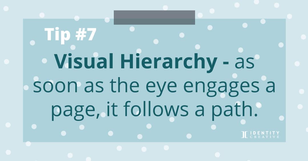 As soon as the eye engages the page, it follows a path.
The eye follows a ‘Z’ path in a fraction of a second, so place the text and graphics strategically on the page.
In an ad design layout, you want to quickly hook your audience with an image or clever headline. Next, lead readers through the page with a sub-head, support text, and call to action.
Using proper fonts size to guide readers to important information will help make your message clear.
Contact info is usually at the bottom of the page. The text needs breathing room or white space. Less text, creatively stating your message, will prove effective for getting results.
Fonts have great potential to communicate an amateurish and unprofessional feel. They also have the power to add emotion, personality, readability, and contribute to a brand’s differentiating look.
Implement these seven tips for fonts in your designs and move people with a sophisticated use of fonts!


Trackbacks/Pingbacks