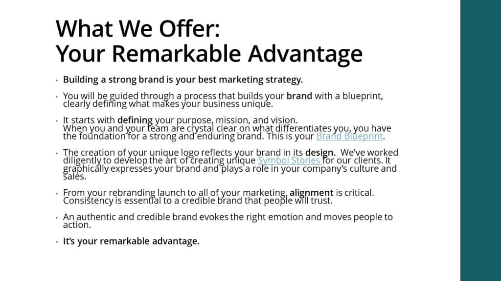
Some companies have banned PowerPoint in meetings and presentations. That’s extreme.
Understandably, when it’s used as a crutch for the presenter’s notes, creates a mundane series of slides, or inflicts ineptly designed pages on the audience, it makes sense to outlaw painful presentations.
When do you use PowerPoint? Sales Presentations? Group Seminars? In the classroom or with colleagues?
PowerPoint can be a powerful tool. However, it can cause you to lose the impact of your message when it’s used in the wrong way. Here are our top picks of common PowerPoint mistakes, and how to avoid them.
Common PowerPoint Mistakes
Slide-scrambled PowerPoint
Having inconsistently designed slides creates a subtle distraction and message. Poor design bruises your credibility. Do your headings jump from slide to slide? Have you set up margins and alignment guides?
Build your brand into the theme.
There is a reason PowerPoint has design themes available. Having a consistent design theme pulls your presentation together. If creating a design theme is not your thing, choose one of the themes available to you in the program. You can change the default font and colors to those that align with your brand’s style guide.
When establishing your design theme, import your company logo and place it in the footer. It shouldn’t be huge, but it should appear on every slide. If you have slides where the image expands the entire slide, then use a transparent white version of your logo as a watermark, below.

Use the right logo image file.
A transparent png. file will give you the freedom to place your logo anywhere without having a hideous white box around it, below.

The Bobble-Head Presenter
If you are constantly looking back and forth between your slides and your audience, then you are a Bobble-Head Presenter.
Distracting your audience with text-heavy slides also puts them in the place of having to choose whether to read your slide or listen to you.
Maybe you’re a nervous speaker, or you don’t have the information memorized. A good way to avoid this type of speaking is to use the presenter notes. You can see these on the computer screen in front of you.
There’s nothing wrong with having notes, they help keep your presentation on topic, and give you the extra assurance of having the points you don’t want to miss.
When your slides SUPPORT your message, rather than serve as your notes, your audience’s attention will be on you and you avoid being a bobble-head.
Image Over-loader
Maybe you’ve made the mistake of using too many or too few images. When choosing your images, only choose those that fully support the point you are making.

Choose your images with a theme in mind. If your presentation is for your company, then you’ll want images that are aligned with the brand. If your company doesn’t have a media library from which you can select images, this is a great time to start one!
Oh and leave out the clip-art—mostly. On a rare occasion it will support your message. Too much clip art and you risk coming across as amateurish. Don’t use images just as a space filler, keep each slide clean and on point.
If you’re on a tight budget, here are a few places you can get free images:
- Unsplash.com
- Pexels.com
- PixaBay.com
- KaboomPics.com
If you are an educator, you’ll have access to these:
- Pics4Learning.com
- PhotosForClass.com
- NegativeSpace.co
- Gratisography.com
When it matters, and you’re building a brand, invest in images that are your own, either purchasing them online—or even better, hiring a photographer or graphic designer to create something truly differentiating.
Text Filler
Are you still making people read your slides while you are talking to them? Seriously?
Have you included too much text? This can be a real presentation killer. Too many words on the screen can bore your audience, and send them day-dreaming of more interesting times. Too little words can be confusing and non-constructive. Make sure your points are short, but not so short that they don’t make sense by themselves.
For Example:
- Pitfall
- Power
- PowerPoint
- Text
- Image
- Less
Key words can be good, but key-phrases will be remembered better. Our key-phrase, pitfalls of PowerPoint, is short but has enough subject matter to be remembered. The bullets above would be good for a note-card with ques for you to remember what you are saying, but they may not be words the audience will remember.

Adding value with text.
When you have a process, checklist, or important information that could help someone overcome a challenge or move them forward in life, here is where text adds value. When people take photos of your slides to reference them later, you know you’re bringing value.
This is another reason to include your logo in the footer of each of your slides (subtly of course). When that photo is referenced later, your company will be remembered.
Only highlight keywords and phrases to add to your presentation. When it makes sense to divide the content, you can create another slide with words.
If you need to fill the whole slide, then animate each text box. In this way, when you speak the next point, people will see that point appear on the slide. The visual reinforces the message they are hearing from you. That’s the power of a presentation: making your point doubly impactful.
Still, be a brutal editor with your text and only use what is necessary. Bullet points will keep attention better than sentences and paragraphs.
Readability Monster
How do you know if you’ve made a bad choice in color or fonts on your presentation? When choosing colors of your font and background, contrast is key.
Dark background? Use a very light-colored font. Don’t use dark-colored text on a dark background. If you are placing text on an image these rules still apply. Don’t let your text get lost in the background because you want to emphasize an image. If that’s the case, add a separate slide with your image or design.

This can be said for your font choice as well. It is better to go with a serif or sans serif font; stay away from the artsy or fun ones. When you need to use text, make readability your number one goal. Read more about avoiding mistakes when using fonts in design.
Less is always more
Try using keywords or images that will remind you of your next few points. Another good idea would be to playback your presentation for yourself before you present.
Stand back as far as someone may be in the room, and see how readable it is. Send it to a colleague and ask them to do the same. If it’s difficult to read or too busy, consider changing things up… colors, fonts, transitions, images, etc. It may look bare once you’ve cut some things out but trust us, less is more.
Put the Power back in PowerPoint
PowerPoint can make or break a presentation. You have a message to share, but your slide presentation has the power to distract and dilute your message and discredit your brand.
Make the effort to craft your presentation so that your slides support and strengthen your message. Make an impact and engage people. Inspire them and change the world.
Don’t lose the Power in PowerPoint. Keep it simple, powerful, and to the point!


