
To maintain a professional and consistent brand identity, you need the 7 Logo Laws. Don’t break them! These Logo Laws are a foundational part of your Brand Identity Standards Guide.
Get your copy of the
LOGO LAW
Reference Guide below!
Your logo is the face of your company.
A brand is a living, breathing organism with an identity. Because a unique group of people creates a brand, it has a distinct personality, idiosyncrasies, and style. In the same way that the name and face identify a person, a name and logo identify the brand.
Your business brand needs to be cared for, protected, and loved. The logo is one piece of the brand pie, yet it has a critically important role. Yes, logos can suffer from abuse and neglect. Your business will suffer if you do not consistently maintain your brand identity. Your brand identity standards guide will equip you to guard your logo everywhere it’s used.
The two goals of branding are to build trust and be remembered. Building trust requires time and consistency and a brand can be remembered for the WRONG reasons, which poisons trust. One of the most significant contributors to bruising a brand’s credibility when the logo and style are inconsistently used.
Consistency, consistency, consistency.
Consistency is the king of Logo Law. Your logo is at the forefront of your brand.
Consistency is a branding no-brainer, but many logo designers miss this part. Unless a brand identity standards guide is created for how you will implement your logo, your brand will be facing an uphill battle for years to come.
A Cautionary Branding Tale
A local business spent over $18,000 on a sign for their building, and the sign company re-created the logo with the wrong font.
While some may not notice, it’s this kind of chipping away at logo law consistency that subtlety bruises your brand’s credibility.
Take inventory. Does everything that displays your logo maintain consistency?
Without a brand identity standards guide (and a team that maintains the brand design integrity), incremental changes will creep in. Take a close look: does your digital stationery, email signatures, print collateral, signs, and graphics on trucks have variations of in color, font, and even your logo?
Well-intentioned Logo Lawbreakers:
- Are employees freely pasting a low-res JPEG of your logo on things?
- Is your logo ever stretched or blurred?
- Does your logo suffer the shame of being in a white box on a solid background?
These logo abuses are a bold sign that your brand identity is being neglected and your brand image is taking a beating.
A Brand Identity Standards Guide: The Logo Law for your brand.
Big brands go to great lengths to protect their brand identity because it matters. Don’t make the grave mistake many small businesses make by neglecting how your logo is used. Get in the game with a Brand Identity Standards Guide.
The Brand Identity Standards Guide lays out the rules for the use of your logo. (It’s also known as a Brand Guide, Identity Standards, Brand Style Guide, Standards Guide, or Identity Standards.)
The guide is the tool you need to protect your brand’s professional look.
Any business that means business will do what it takes to keep their logo law for a consistent brand identity.
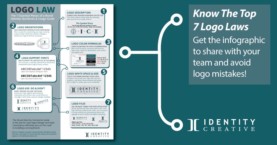
The seven most important Logo Laws in a Brand Identity Standards Guide.
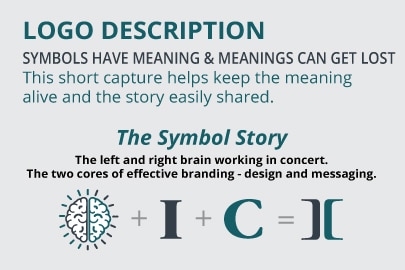
1 – THE LOGO DESCRIPTION: Your Symbol Story
This is a brief explanation of the meaning behind the logo: your logo symbol story (see more examples here). A thoughtfully developed brand identity is going to possess meaning. Succinctly telling the story here, equips the brand managers to convey the depth of the brand identity within and without the organization. Your brand story instills an appreciation for its value.
For example, here’s the description of the Identity Creative brand identity:
The Identity Creative company brand identity is a symbol & name logo-design style. The sophisticated but friendly uppercase, Trebuchet font, used for IDENTITY, compliments the uppercase Garamond Narrow CREATIVE subtext and provides a balanced font-foundation.
The unique 2-part, 2-color “I” and “C” symbol represents the left & right sides of the brain, as well as the two aspects of a brand, design & messaging.
This communicates the idea of a process that creates a unified and impactful brand impression.
Identity Creative’s purpose is to identify the unique value in every brand and connect it with the people they seek to serve. This composition of graphic and typographical elements creates a unique impression. It tells the story of what Identity Creative does to fulfill its purpose in the world.
A company logo that helps tell the brand story deserves to be known. The standards guide sets that standard.

2 – LOGO ORIENTATIONS
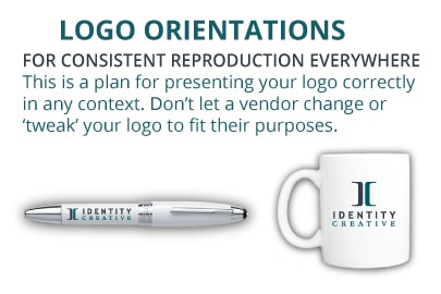
Your logo will need to fit into a variety of spaces and a plethora of media applications. A mistake often made by small business brands is that they don’t plan for this.
Whether it’s on a pen, a mug, a billboard, or a social media post, your logo will need to conform to the space restrictions of that application. These include vertical and horizontal constraints.
To account for this, the appropriate logo file types need to be created in various logo orientations. The Brand Identity Standards Guide displays the PRIMARY logo orientation. This is the first one used for general purposes..
If logo orientations are not established when it is created, a well-meaning employee or vendor will create their own interpretation of your logo to fit the space they need. That’s where the trouble comes in.
A Cautionary Branding Tale
One of our clients had a promotional products vendor filling an order for travel mugs. The vendor contacted us to get the original Adobe Illustrator artwork. When questioned why he needed it, said that an intern gave him the horizontal logo and it would not fit the mug.
Sending working files for someone to ‘recreate’ your logo is a no-no!
Our client’s intern sent the wrong logo file. He did not know about Brand Identity Standards Guide that showed him how to use the logo. Ouch! We quickly sent over the proper logo file they needed to fit the mug perfectly. This story had a happy ending with marvelous mugs.
3 – LOGO COLOR FORMULAS
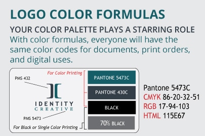
Since the logo will likely be reproduced in a variety of forms, accurate color consistency is a must. To help ensure color consistency across every visual platform, the Brand Identity Standards will include color formulas for each color in the logo.
Color details will include the Pantone Matching System (PMS) colors as a starting point for each color in the logo. These colors are based on the PMS Color Bridge, the color swatch book used as the universal color standard from which the three following color formulas are determined:
CMYK (cyan, magenta, yellow, and black): for process printing.
RGB (red, green, and blue): for digital documents, web and onscreen bitmap viewing.
HTML or HEX: a color code used to replicate a color online.
A comprehensive Brand Identity Standards Guide will also include an extended color scheme. These additional colors are triadic, analogous, or complementary hues based on the logo’s main color. This approach to color science takes into account the harmonic visual relationship these colors will have together in their marketing support applications.
4 – FONTS
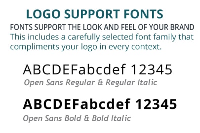
Significant thought has gone into the selection of the logo font and its supporting fonts to complement the font used in your logo.
Logo Font
The font(s) used to create the logo needs to be listed in the Brand Identity Standards Guide. It will also include how it may have been customized to create the logo.
Supporting Fonts
Supporting fonts have been carefully chosen to complement the logo font. Your company font carries a personality and tone. You don’t want employees picking the font-of-the-day to fit their mood when sending your email newsletter or feeling fanciful in their email signature.
Font families are used for marketing and web support and help maintain the personality of your brand.
Font families will include regular, medium, and bold font faces with italicized options for each. The broader the font family, the more versatility for marketing use. You don’t want a zoo of fonts.
By predetermining font parameters, the integrity of your brand identity will be protected. Along with training, well-meaning employees will be stopped from using their personal favorite fonts in your company email signatures and PowerPoint slides. Know your fonts and how to use them with these guidelines for using fonts.)
5 – WHITE SPACE AND REDUCTION LIMITS
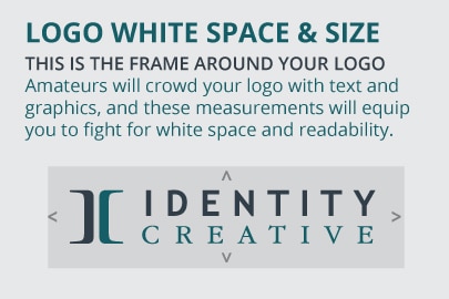
Two big issues that often creep in with a logo’s use are crowding and over-reduction. Without realizing it, the logo can become encroached upon with text and graphics. White space parameters protect your logo and keep it clean.
The other issue is not realizing the logo can only be reduced only to a certain point. When this happens, the details blend into a blob or disappear altogether.
It takes a conscious effort to maintain an invisible fence around the logo to keep it safe and uncluttered while keeping it big enough to retain detail.
A Cautionary Branding Tale
After a rebranding with a client, we were happy to receive a gift of their logo-emblazed coffee cup. Regrettably, the vendor had placed the phone number and web URL within ‘kissing distance’ of the logo. (This is why we encourage all of our clients to send us a proof before placing an order to help guard the brand identity.)
The logo was uncomfortably close to the contact information and gave the mug a cheap, unprofessional feel.
6 – LOGO DO’S & DON’TS
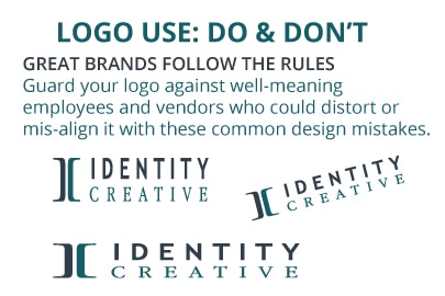
Yes, there are incorrect ways to use your logo files. This is a big mistake we commonly see. Here is where the ‘wild, wild, west’ of logo use really needs to be policed by your chief brand officer. Just because you can, doesn’t mean you should.
It’s critical to the effectiveness of your brand’s identity that it be properly presented without “creative” liberties applied to it by employees or vendors.
Rotating, stretching, boxing, colorizing, adding effects like gradients and drop-shadows, or “just having fun” with the logo are all temptations that amateur designers can fall into. Where consistency strengthens a credible brand image, inconsistency kills it. Brand Identity Standards Guides are useless if they are not understood and consistently followed.
7 – LOGO FILE NAMING & USE
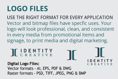
Your raster and vector logo files should be named logically in your Brand Identity Standards Guide. Create folders that will organize your logo files for their specific uses. Raster or bitmap files (like JPGs & TIFFs) have a distinctly different use than vector files (like EPS or PDF files). Vector files are comprised of points, lines, and fills. When scaled up, they never degrade in detail or pixelate, like raster files.
Each of these plays a different role when it comes to reproducing the logo. Your logo law is followed by using the right logo file, as outlined in a proper Brand Identity Standards Guide.
Maintaining a Professional Brand Identity
When your designer provides logo files, make sure you have someone on your team who understands how to properly implement them. That person also needs to have authority in your company to maintain standards with everything that is produced.
If you did not receive a Brand Identity Standards Guide when your logo was created, invest in one. Seek out a professional who can create the system you need to maintain a professional brand identity.
When a comprehensive, detailed, ‘how-to’ strategy for effective logo use is adhered to, it builds credibility for your brand. The opposite is true. When a logo is changed to fit various contexts, a subtle disaster occurs and it becomes diluted in its impact.
Guard the integrity of your brand’s identity by following your Brand Identity Standards for a remarkable and robust brand.
We’ll send the Logo Law Reference Guide to your inbox right away!
Tell us where to send it, below.
(Your email is never shared.)


Trackbacks/Pingbacks