
")
When your logo is in print, does the color look wrong?
Have you ever had the color of your logo look flat, washed out, or simply wrong? You might not be able to put your finger on it, but it seems off. Maybe an orange looked brown, a blue looked purple, or a forest green had an olive tone. Selecting the right colors for your logo will help you avoid this common problem.

A Cautionary Color Tale
A local insurance company hired a web designer for a new logo design. The colors they picked from the selection he presented were a stunning combination of black and a deep royal blue. When they received their printed business cards, stationery, and presentation folders, while the black looked good, the vibrant blue came out purple shown below.
The designer presented logo concepts in colors online. Of course, the colors were bright and bold because any color made visible with light will be brighter than when that same color is printed with ink on paper.
The printed results were so disappointing that we went back and explored color options that would present well in print. Some brands struggle with color printing quality for decades until they rebrand.

An example of PMS Reflex Blue on the screen than in process printed form.
Color Matching: How Your Brand’s Colors will Reproduce in Print
A professional logo designer will select colors for your logo based on many factors, such as differentiation from competitors and the brand’s personality. Yet the most commonly missed – yet critically important – is considering how your logo’s color will appear in print.
From your standard in-house office printer to ‘process’ printing by a professional print house, you want your brand’s colors to be as consistent as possible.
It merits a ‘colorful’ dive into the difference between PMS (Pantone Matching System) colors and Process or CMYK colors to fully understand the problem. A solid understanding of each print method can save you major printing headaches for years to come.
Color formulas and your brand
Let’s cover a few color pointers.
You may already be familiar with the color codes used in electronic and print media:
- Print: CMYK, PMS
- Electronic/Digital: HTML/HEX, RGB
Designers use RGB and HEX formulas for viewing online. These colors will show a degree of color variation depending on the calibration of the monitor or device. To get your brand’s colors accurate in printed materials, we need to understand PMS and CMYK color printing and how they impact your brand.
How PMS Colors Print Your Brand’s Colors
PMS (Pantone Matching System) colors are based on an internationally recognized color system referenced by designers. Pantone established the graphic standards system for professional designers in 1963, and it has morphed into a universal color language. By using a definitive color system, printers, graphic designers, and web developers can achieve consistent color results.
PMS colors are also known as “spot colors.” These are the precise, single-ink formulas and will reproduce consistently in print. The pre-mixed inks are based on existing color formulas and align with a specific PMS numerical system.

Printing with PMS inks, produced through the off-set printing process, assures consistent color reproduction. However, because PMS ink colors are specific pre-mixed formulas, they are a significantly more expensive process. PMS inks are typically used where colors require an absolute consistent appearance from piece to piece. Examples could include packaging, large company brochures or high-end marketing collateral.
How Process Colors (CMYK) Print Your Brand’s Colors
Process ink colors, or CMYK, are recreated during the 4-color, or full-color, printing process directly on the printing press. The four ink colors—(C) cyan, (M) magenta, (Y) yellow and (K) black are applied at the same time in the printing process.
Due to the advancement of hi-tech print technology in offset and digital printing, the cost of this kind of print production has significantly decreased. Lower cost and higher quality make it the go-to type of printing for most marketing print pieces, like full-color booklets, brochures, sell sheets, postcards, and business cards.
By combining overlapping, separate layers of varying screened percentages of each of the four colors, just about any—but not all—PMS color can be replicated. It’s the “but not all” where brands can fall into the murky-print-color-abyss. We can avoid that early in the game with the PMS Color Bridge Book!

A close-up of a four-color offset printing press with the CMYK inks.

A color bridge compares PMS inks to CMYK inks.
One simple step can save your brand color pick.
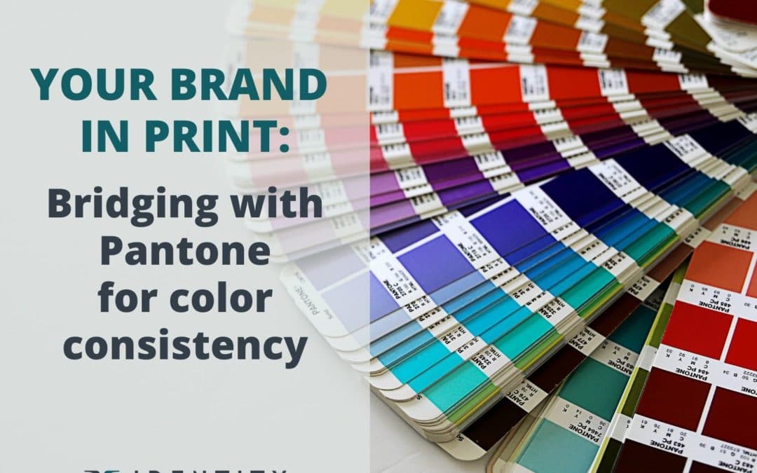
Before you run with a color pick for your company’s brand, look it up in the PMS Color Bridge. Every professional designer will have one. The Pantone Bridge book shows both printed PMS swatches and Process Printed swatches positioned next to each other on the same page.
There are two PMS Color Bridge books, one for coated paper and one for uncoated paper stock. You will want to see both.
Every business at some point will print their brand colors on both types of paper. The coated stock has a finish applied to the paper, like gloss, matte, or satin. Colors tend to look brighter on this kind of paper because the ink literally sits on top of the finish. On uncoated paper, ink is absorbed into it and appears duller by comparison.
Uncoated stock will normally be used to print items like letterhead, envelopes, shipping boxes, and outputs from a normal office printer. By comparing both PMS and CMYK color results side-by-side in both coated and uncoated PMS bridge books, you will get a clear picture of how well your PMS color will appear in 4-color print.
Though printing is never an exact science, for brand consistency, the goal is to replicate the PMS color as closely as possible with the provided CMYK formula. In the example below, you can see how some CMYK colors (on the right) can print much closer to the actual Pantone color (on the left). Other colors are almost impossible to match. When you see that comparison, it’s time to move on to another Pantone choice.

- pantone book")
Think Finishing in the Beginning: Rebranding and Your Logo’s Colors
The PMS matching system provides a definitive color system for you to achieve consistent color results in every application. While process printing with CMYK inks can replicate nearly every color of the spectrum it has its limitations.
By referencing a printed PMS Color Bridge, you can almost guarantee you’ll get a consistent color when process printing a Pantone color. We advise our clients to select colors that “bridge well.” Colors that appear consistent in both the PMS and CMYK colors will be a good pick for consistent, true color replication for your logo and brand’s color palette.