Midway Rotary
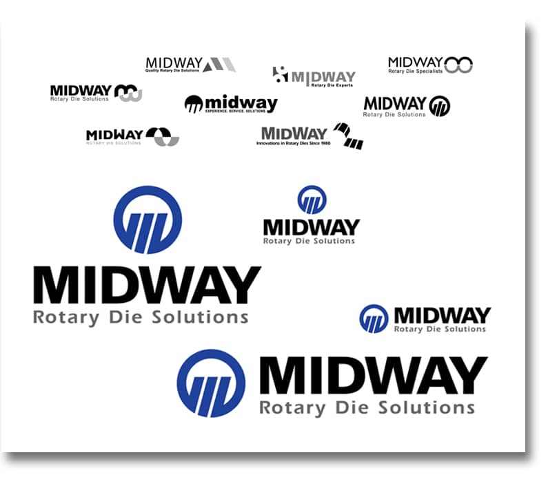
It was obvious that Midway Engravers needed to come into the 21st century. Not only was their business name obsolete (since they no longer specialized in engraving) but since 1974, their current logo was miscommunicating their specialty – precision rotary dies. By updating their name and developing a new symbol which graphically captured the nature of their products, expertise and the letter M, Midway quickly set the precedent for the coolest corporate identity in the rotary die industry.
Keep the Business Name?
Often it’s not the CEO or business owner who perceives the need to update a company’s image and rebrand. Likely, it’s the feet on the ground, the sales team who have to go up against the competition with little or no brand support. This was the situation with Midway Engravers. The old logo and name made reference to technology and processes that were out-dated. While Midway Engravers was a progressive and innovative company, it didn’t look like one.
When Doug came on board, he won the executive team over to the idea of rebranding and engaged Identity.. Once the Identity team had a grasp of Midway’s USP, mission, values and vision through the Brand Profile process, collaboration began on a name that would fit the company in the present and for future growth.
Brand Recognition
What about Brand Recognition? How will they recognize us?
For some, the concern that rebranding will set them back because people will not recognize the new face of the business. That’s an understandable concern. There is a right and a wrong way to rebrand and introduce the new brand. When it’s done correctly, with impact, it’s motivating and can bring a company’s image to new heights.
“While the return on investment in a rebranding project is not easy to measure in dollars and cents, it is evident that our brand is commanding a new respect in our marketplace, which in turn has led to new sales. We are proud of our new look, and eager to use it in our upcoming marketing campaigns. Our rebranding has definitely played a role in our recent growth, and I know that it will continue to represent us well for many years.”
Doug Edwards
Director of Sales & Marketing
Brand Alignment
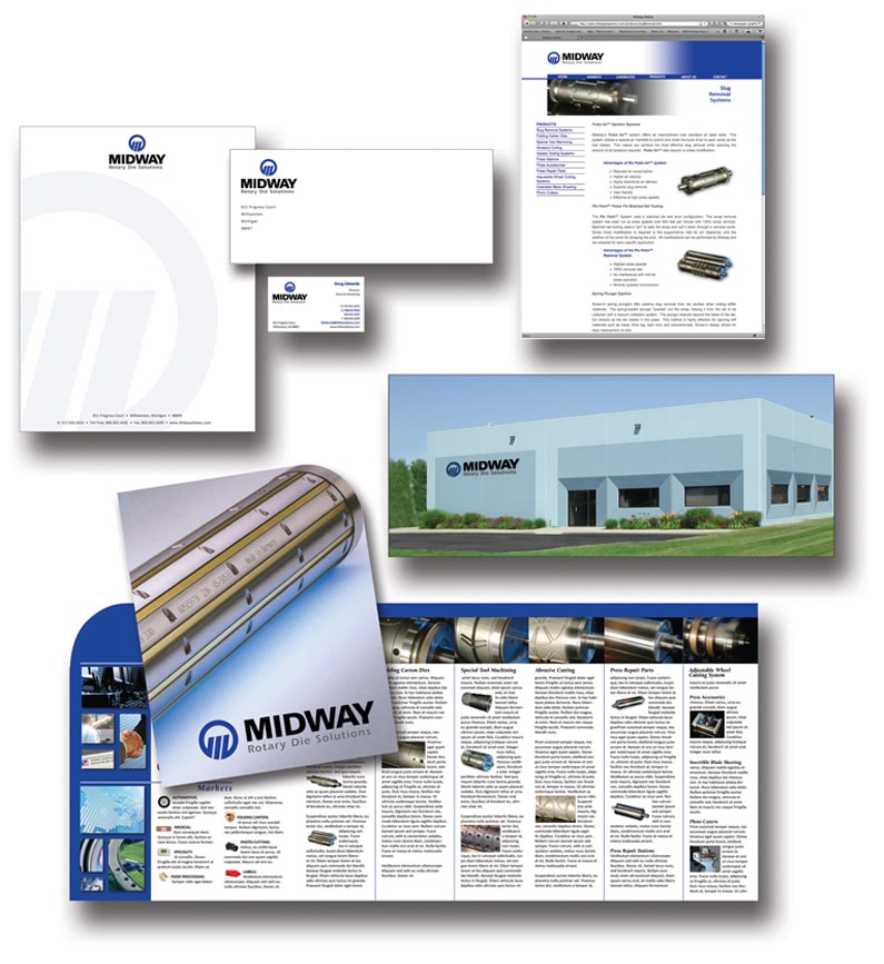
Since 2009, Midway has worked with Identity on various graphic design & creative ad campaigns. Because we have invested the time with the Midway team and understand their mission and values, we are able to maintain consistency in messaging and design.
For a busy Sales & Marketing Director, that means less time directing the creative designer and more time focusing on the things that his company needs him to do. It also means a greater return on marketing dollars. Without consistent guidance, a company’s marketing & sales materials can become disconnected from the brand message and have a piecemeal, inconsistent look.
Consistent design with clarity of message: we’re more than Midway to building brand recognition that pays!
Our rebranding with identity included a company name change to better define our business and clarify what we do. Since implementing the changes we continue to receive extremely positive feedback from customers. They comment about the professionalism and excitement that our new brand brings to Midway. It’s a great mark that presents a strong image, and I’m very pleased with the way the folks at IGD collaborated with us to understand exactly what we needed, and then delivered a fantastic brand.


