
Lorio Ross Entertainment
From Glory to Near Distinction
Founded 1972 by Jerry Ross, leader of the JERRY ROSS BAND” and Sam Locricchio, (the LORIO band leader) as a talent and booking agency, Lorio Ross Sterling Entertainment became one of the largest full-service entertainment and production companies in the Midwest, serving Fortune 500 Companies across the U.S.
Like many companies, when marketing shifted with the dawn of the internet, Lorio Ross Sterling Entertainment did not adapt their marketing efforts. With new competitors on the rise and the format for entertainers to promote and market themselves, the company was in danger of becoming obsolete.
The leadership team recognized that rebranding for today’s market was an imperative part of their survival.
Shopping for a Logo Face-Lift
Prior to engaging Identity Creative, the team at Lorio Ross decided that they would first try crowd-sourcing to update their logo. They put forth their request and received a smorgasbord of ideas. In themselves, they were not bad: good designers are everywhere.
What was bad was the process and the presentation. The logo concepts were mocked up in color, and displayed in a variety of colors, stationery layouts, and other media. While these look cool they hinder an important part of the logo design and selection process.
The ideas were solely typographical, and while mostly clean, were nondescript and did not generate meaning that was relevant to the brand. The nature of “getting a logo design cheaply” through crowd-sources means that the process is very shallow. There’s not time to dig-in and ask the probing questions which would identify what makes Lorio Ross unique.
Instead of working with them to discover what will make them stand out in the marketplace. The online forms that are provided ask a few general questions before designers begin working on concepts with very little knowledge of the company’s brand, history, or market strategy.
Here are three logo designs that crowd sourced designers presented to Lorio Ross:
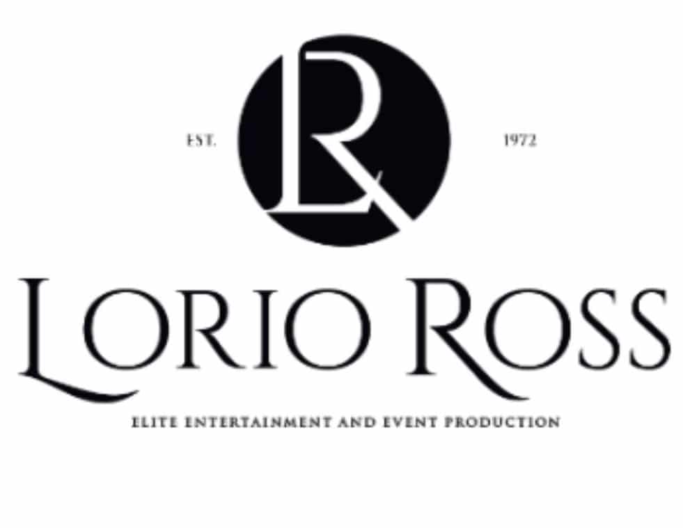
By placing the logo into an enhanced context as shown here, it distracts the client from seeing the poor design production. This would include the GAPING space between the L and O in L ORIO, the microscopic floating ‘1972’ to the right of the black circle, which should be balancing the ‘EST’ on the opposite side, and the barely readable subtext, to name a few.
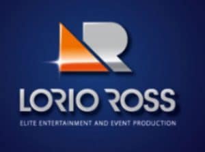
Here’s another example of taking an OK design and tricking it out with too much information. When creating is the Adobe Suite design programs, the saying, “just because you can, doesn’t mean you should.” The use of drop shadows, multi-color gradients, and glints. Ouch! Try replicating this design in all its glory onto an embroidered shirt or cut vinyl for an entry door. This would need to be re-created again and again, watering down brand consistency.
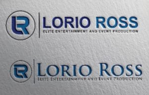
In this design, while the debossed mock-up looks cool, it distracts and makes it difficult for the client to see its design flaws. Uneven line weights create imbalance and poor word-spacing makes it look hurried. This design is actually two: showing two ideas on one page, creates confusion in the desicion-making process of selecting a logo. If a separate type concept might work, the designer should pick the best choice and show it. Adding color choice at this point in the process is adding complexity and confusion to the process. This is too important to just toss out a few designs!
Lorios Ross Needed More Than a Logo
An effective rebranding looks at the company as a whole, not just creating a facelift. Lorio Ross Sterling Entertainment had neglected their brand identity and it needed to be defined.
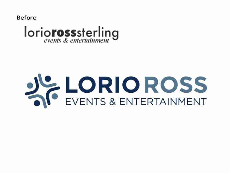
Working through Identity Creative’s process, the leadership team solved the nagging problem of their name and descriptor. We solidified their questions and agreed that it made sense to drop “Sterling” and shorten it to Lorio Ross. The descriptor and slogan would be decided, once their brand strategy had been clarified.
Clarifying What Makes Lorio Ross Unique
Through our process we uncovered the abstract pieces of their brand–the kind of things that people on the inside of a company take for granted and often miss. We find it all the time: leadership can’t see what makes them unique!
Finding a Rebranding Partner
When Lorio Ross realized this disparity, they reached out to Identity Creative and took the first step to revolutionize their brand. The first step IC took with Lorio Ross was to bring them through was a series of critical questions that addressed their past, present, and especially their future. These helped clarify ‘who’ they wanted to be, created a list of keywords and concepts and laid the foundation upon which the brand was built. The brand essence of Lorio Ross is “Creative Events.”
It’s important to identify the three key differentiators for their brand. These are not easily copied and will inform the marketing messages. Here are the three primary differentiators for Lorio Ross Entertainment:
- 1. Entertainment Soul: Entertainment is our DNA.
– The belief that talent and entertainment are not equal.
– Our standard of excellence requires that our entertainers have the necessary skills to connect with people and connect people-to-people.
– Trained entertainers & agents recognize and vet to provide ONLY exceptional, top entertainers - 2. Creative: As event artists, we naturally want to create.
– We are motivated to do something new each time and make each event unique.
– Our best clients want to explore superior entertainment and event possibilities.
– Our greatest satisfaction is seeing the event unfold with mastery to the delight of everyone involved. - 3. Experienced: The ability to transport people to a place of freeing fun and elevated happiness
– We cover all the moving pieces of an event, big and small. (Hosts should enjoy the event as much as everyone else)
– Beyond exceptional project management: Experience that anticipates every detail and manages any obstacle for seamless, stress-free events.
– Connections with a deep network of coveted entertainers and reputable professional vendors
A Refreshed Brand Identity on a Solid Foundation
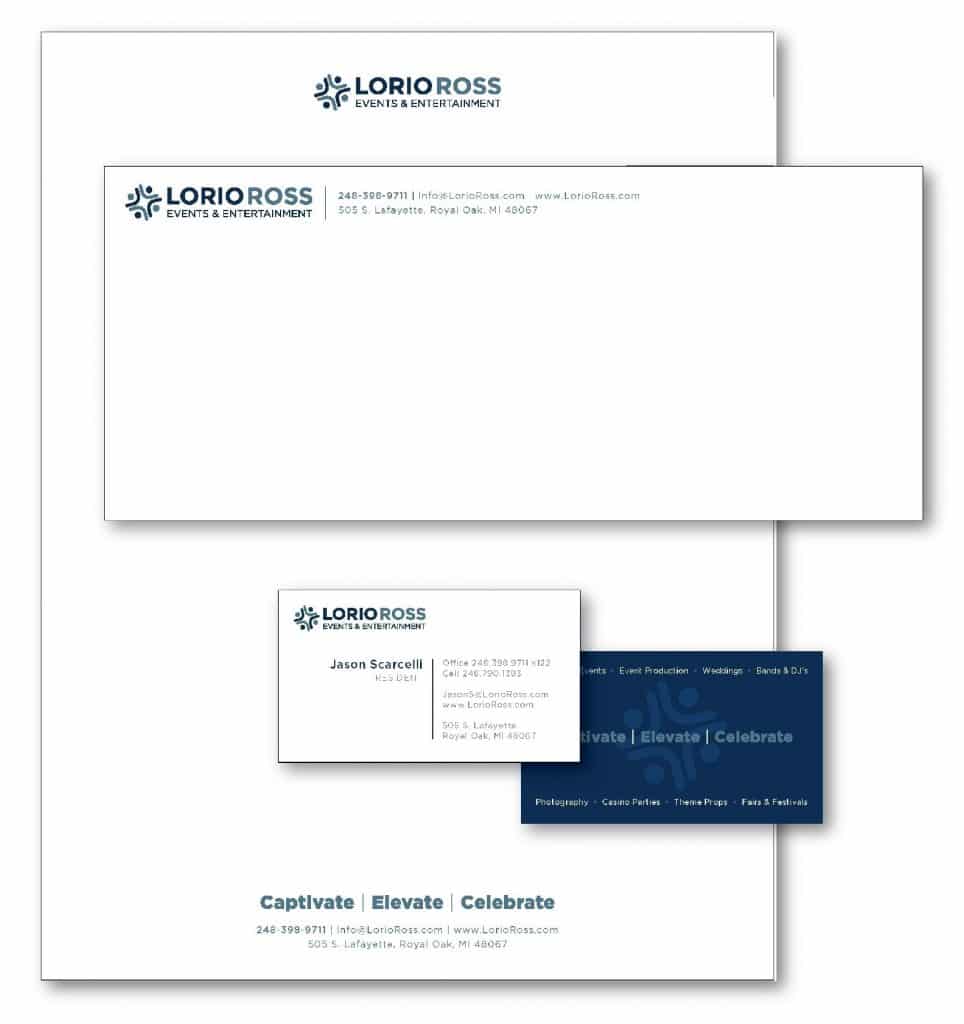
Once their foundation and brand strategy had been clarified, we moved forward into creating a unique design solution. Several ideas were presented, and the final design selected was a symbol-name logo-design style. The timeless Gotham Bold font was used for the business name and was supported by the Gotham Medium EVENTS & ENTERTAINMENT sub-text. Together these two created a balanced font-foundation for the trademark.
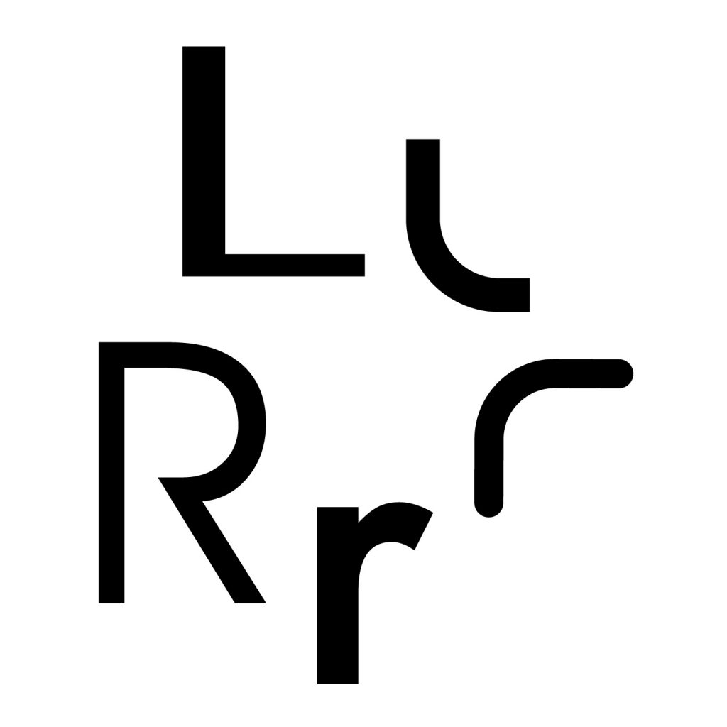
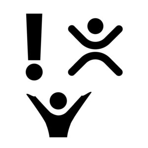
The new representational symbol, comprised of U&lc (upper and lowercase) ‘L’s and ‘R’s, symbolized diverse people coming together and celebrating as one. Working with the Lorio Ross branding team, we reviewed a number of options for the descriptor. It was decided that we would reduce the current descriptor from “Elite Entertainment and Event Production” to “Events & Entertainment.”
This celebratory, unified composition of elements in the classic and sophisticated blue hues effectively captured the progressive brand essence that Lorio Ross desires to convey to the world.