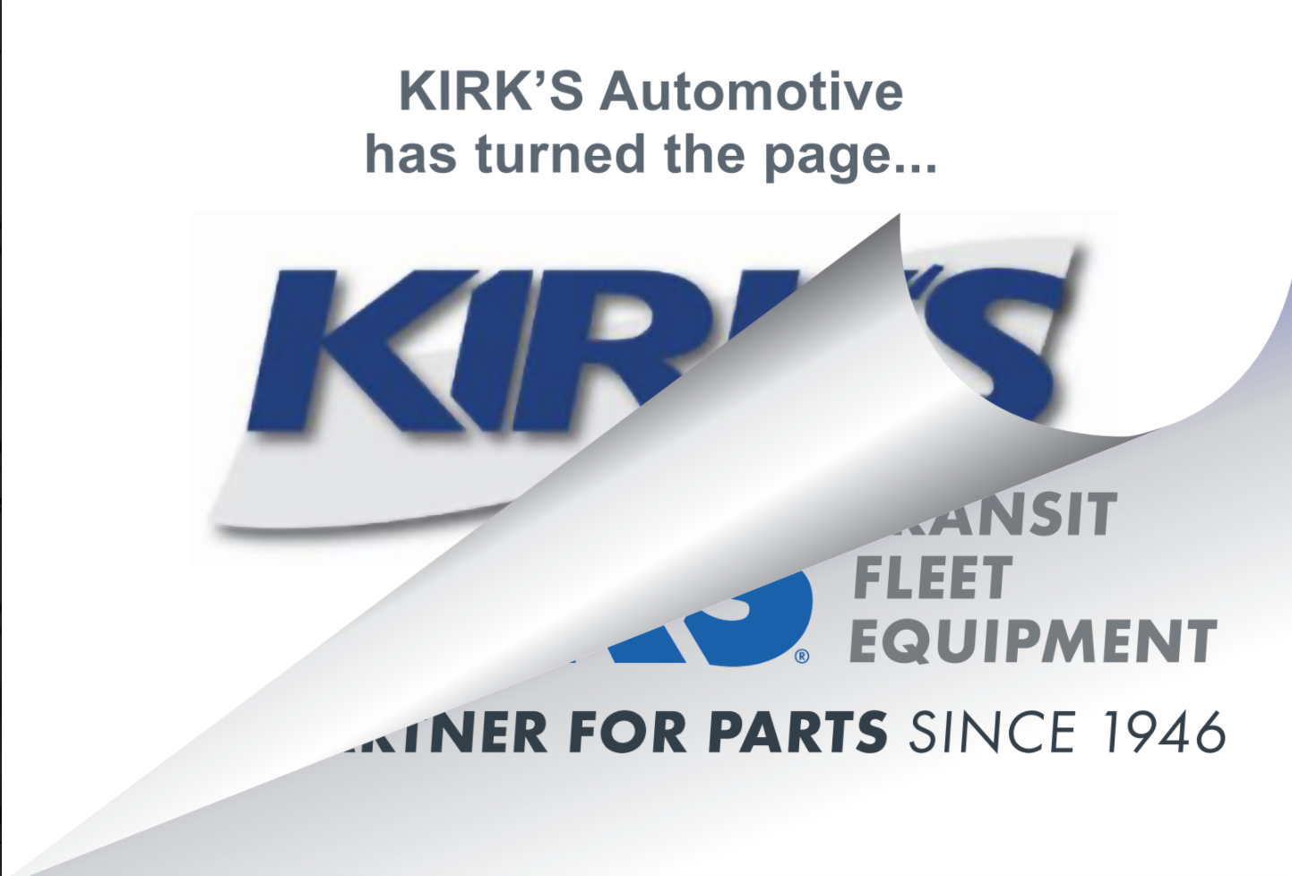
After 75 Years of Innovating Solutions for the Aftermarket Parts Industry,
Kirk’s Automotive is Now KIRKS!

A Rebranding Case Study: Celebrating 75 Years of Innovation
PROBLEM:
Kirk’s Automotive had outgrown its brand.
In its 75th year, Kirk’s Automotive had an impressive legacy with industry-leading solutions. Yet the company struggled with an outdated brand that did not communicate its high level of engineering capability and service. Further, the name “Kirk’s Automotive,” created confusion about the industries they serve.
Founded in 1946, Ernest Kirkman fulfilled a need for rebuilt carburetors after WWII. The company naturally grew by meeting the needs of its customers, serving major automotive companies, dealerships, and in the 1980s, expanding to the fleet and transit industries.
In 2021, the brand needed to communicate its strength as a nationally recognized supplier to the fleet and transit customers.
SOLUTION:
Engage in a creative process for updating the KIRKS brand and position it for growth.
The leadership team hired Identity Creative to rebrand the company and develop a clear message and updated look. The objective was to position the company for growth and quickly communicate the industries they serve and the value they bring.
Together they worked through a process that began with clarifying the brand’s DNA. Starting with purpose, and recalling the roots of the company, they reconnected with the mission and values that originated with their founder and have been passed down through three generations.
This kind of exploration builds on the strength, purpose, and unique value of the company, making the brand sustainable for future growth.
Through this process, outlined below, answers to the branding issues surfaced and the brand’s core messages became crystal clear.
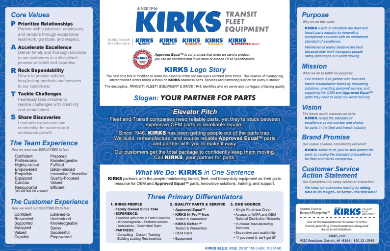
Phase One: Clarify
- Explored their roots, clarifying the company’s DNA
- Defined their purpose, mission, vision, and core values
- Reinvigorated their customer service statement
- Boldly identified their three key differentiators
Phase Two: Create
The day of the logo concept presentation comes with anticipation, excitement, and energy.
The logo concepts included designs ranging from concepts that paid homage to the original logo, then moved toward various solutions. Each idea was considered for its value in communicating the KIRKS brand.
The leadership team quickly narrowed it down to concepts they thought would be ideal, yet they wanted to include employees in the decision-making process. The concepts were posted in a central location and silent votes were taken.
The input from the sales team and employees added valuable insights and confirmed the decision for the branding team. Inviting feedback from employees also helped build enthusiasm and buy-in to the final design choice.
Before
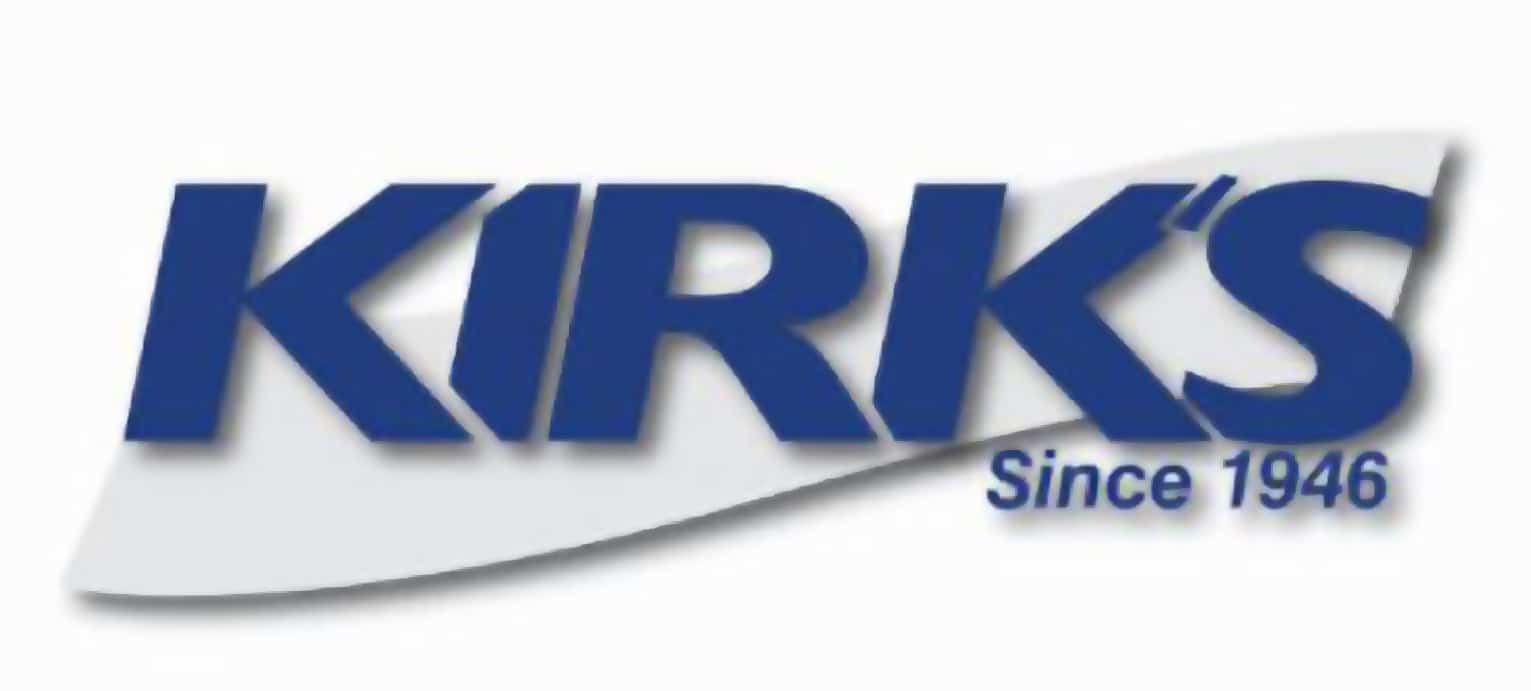
After

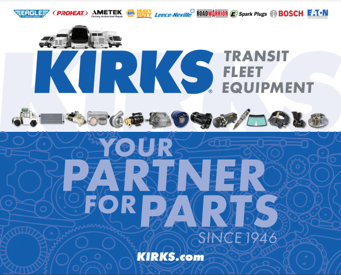
The new bold font was modified to retain the essence of the original logo’s notched letterforms. This nuance of overlapping, interconnected letters highlights KIRKS seamless parts, services, and partnering support with every customer.
The descriptor, “TRANSIT | FLEET | EQUIPMENT” immediately identifies the industries they serve. The slogan, “Your Partner for Parts,” and “SINCE 1946” communicates their legacy as reliable partners for parts.
KIRKS needed a way to quickly help customers understand the variety of available products and services, including proprietary manufactured and refurbished parts, in-house manufacturing services, training, tooling, and access to NAPA and OEM National Distribution Networks.
Four key areas were identified, each with a coordinating design to create a brand architecture that informs and guides people to the products and services they need. It also serves to educate customers about other products and services offered by KIRKS, facilitating the sales team’s job of cross-selling to current customers.
KIRKS Proprietary Manufactured Products
KIRKS Reliable and Remanufactured Parts
KIRKS NAPA Full-line National Distributor
KIRKS Proprietary Training, Support, and Tooling
KIRKS Approved Equal™
The secret sauce, KIRKS Approved Equal is a key differentiator. They needed a way to give customers confidence that the parts they received, whether manufactured or refurbished in-house or sourced from other suppliers, met KIRKS’ strict standards of reliable quality.
Buyers and maintenance managers know that the term “approved equal” means that a part has met or exceeded OEM specifications. That matters whether KIRKS is shipping their load-tested refurbished hydraulics and alternators, or brakes and steering systems.
We developed the KIRKS Approved Equal™ logo and seal to serve as a mark that customers can rely on.
The KIRKS Approved Equal™ seal is backed by KIRKS’ bold in-service warranty and assures customers that their OEM warranty will not be voided when installing parts delivered by KIRKS.

Approved Equal™ is KIRKS’ promise: “When you purchase a product from us, you can be confident that it will meet or exceed OEM specifications.”
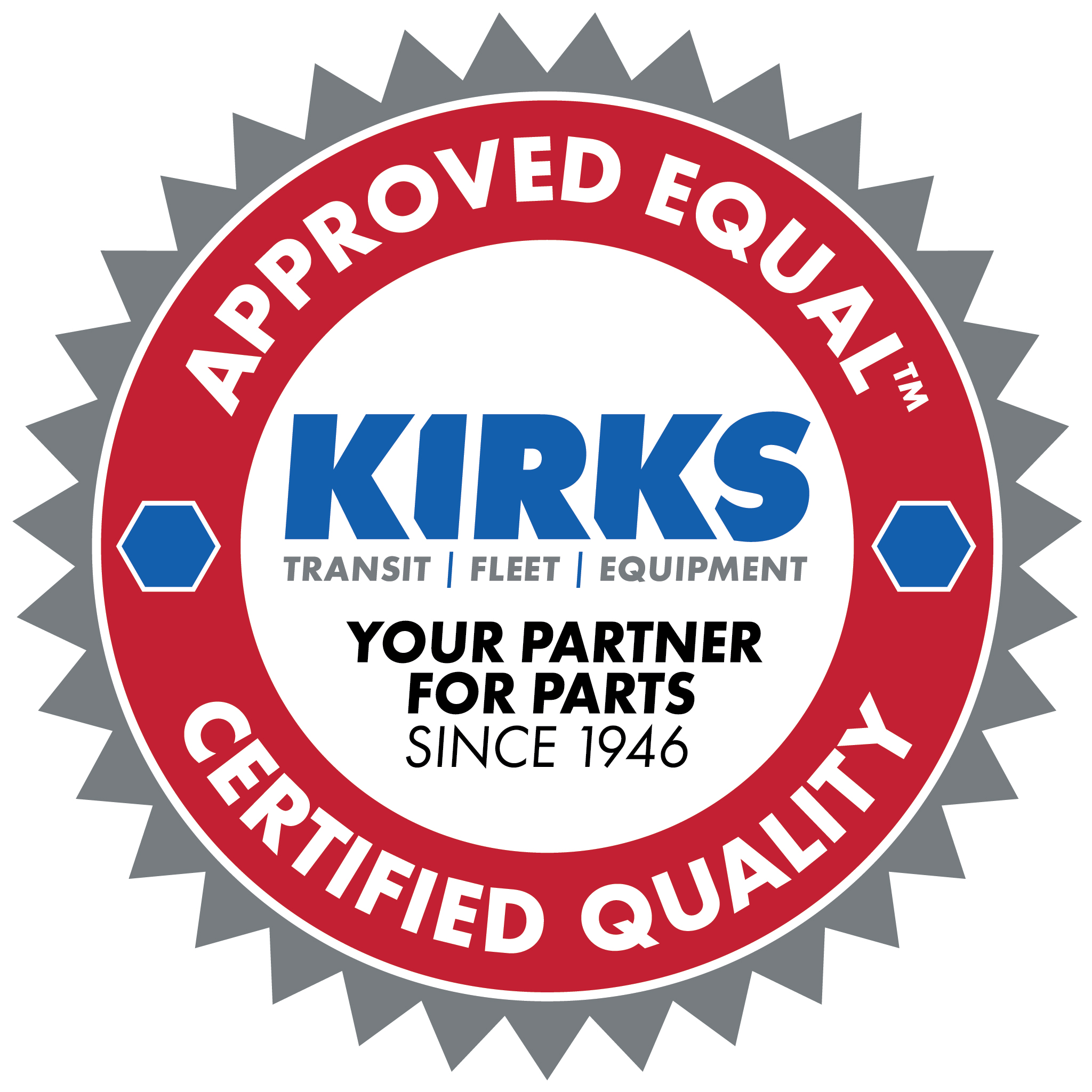
KIRKS’ Approved Equal™ Seal of Certified Quality removes the risk of purchasing repaired or non-OEM level parts. KIRKS delivers remanufactured and specially engineered parts that fleet maintenance professionals rely on to keep things running.
Phase Three: Connect
Using the StoryBrand™ method, we developed a brand message foundation through a process that helped put the branding team in their customers’ shoes and see the world from their vantage point.
The workshop enables the branding team to identify the problems facing their customers and develop customer personas grounded in reality. This is an exercise in empathy, surfacing feelings and words that enable us to connect with customers in their language.
Launch Kit
Internal Documents
A rebranding launch will require updating internal documents like email signatures, digital stationery, and invoices.
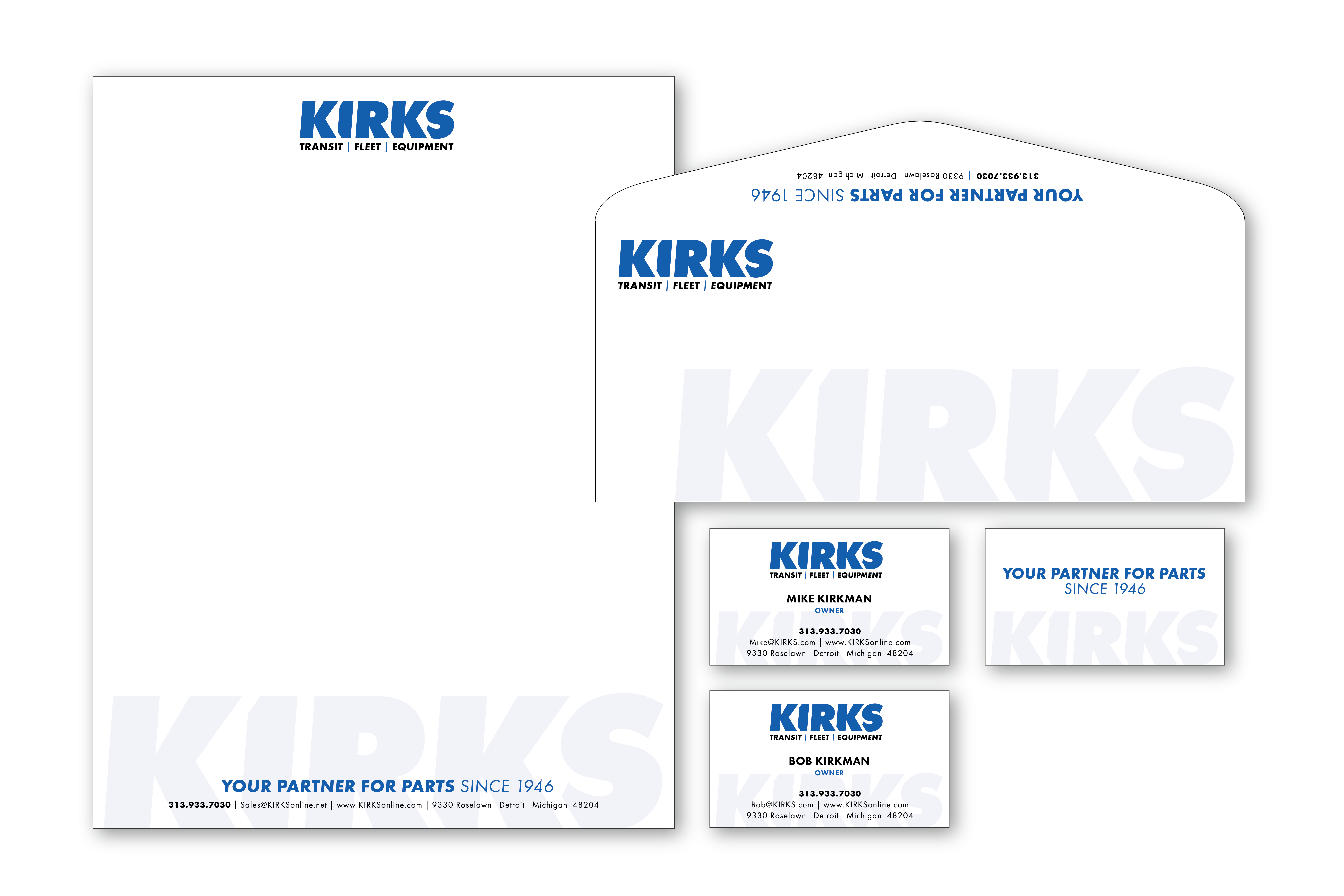
Company Stationery
Custom Email Signature
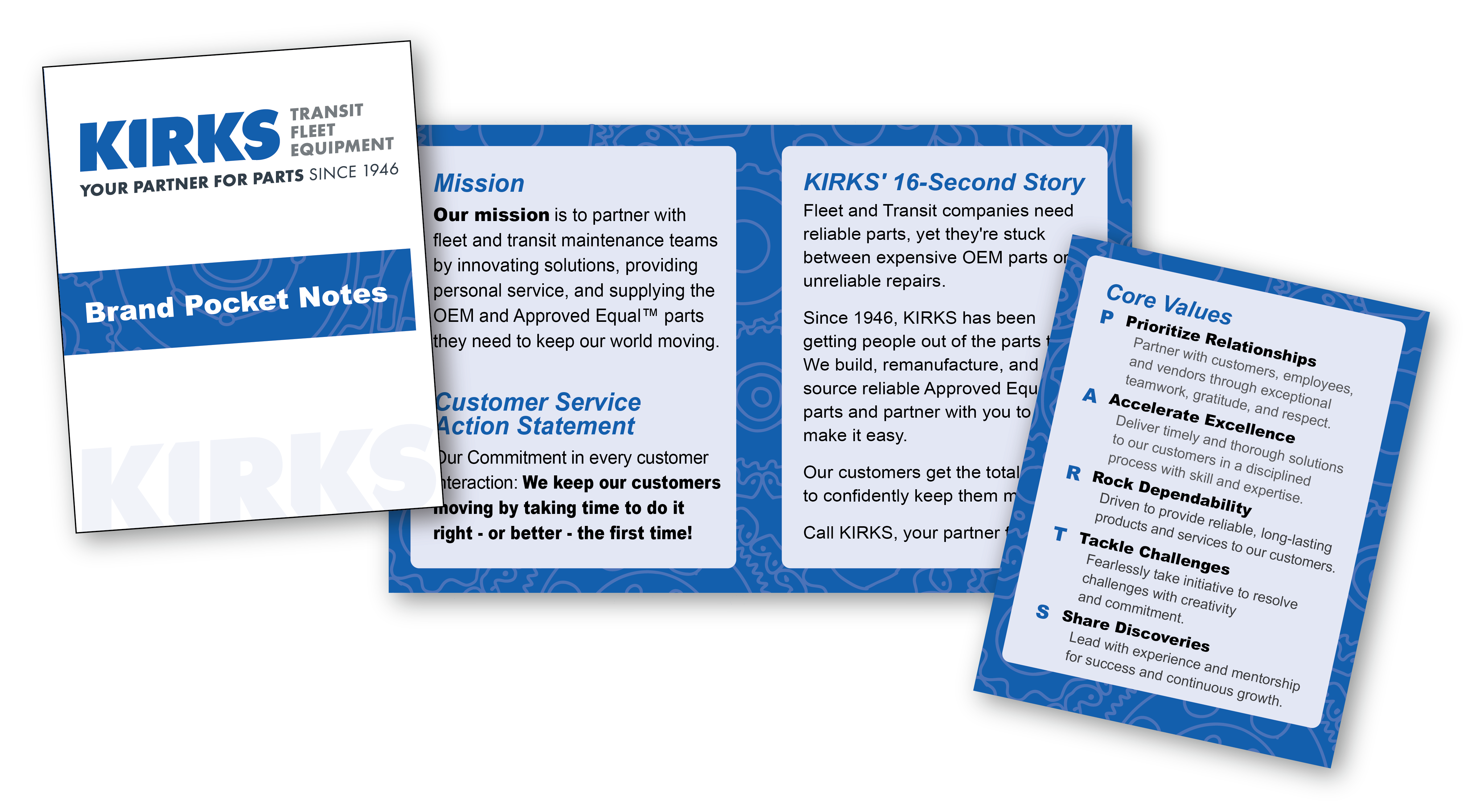
Employee Brand Pocket Notes
Marketing Collateral
KIRKS Brochure
KIRKS Tradeshow Banner
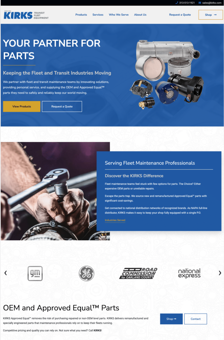
Online
Website
LinkedIn Header

Celebrating KIRKS History
Three generations of Kirkmans have shared the same dedication to doing things right the first time. They prioritize relationships and tackle challenges with creativity and commitment.
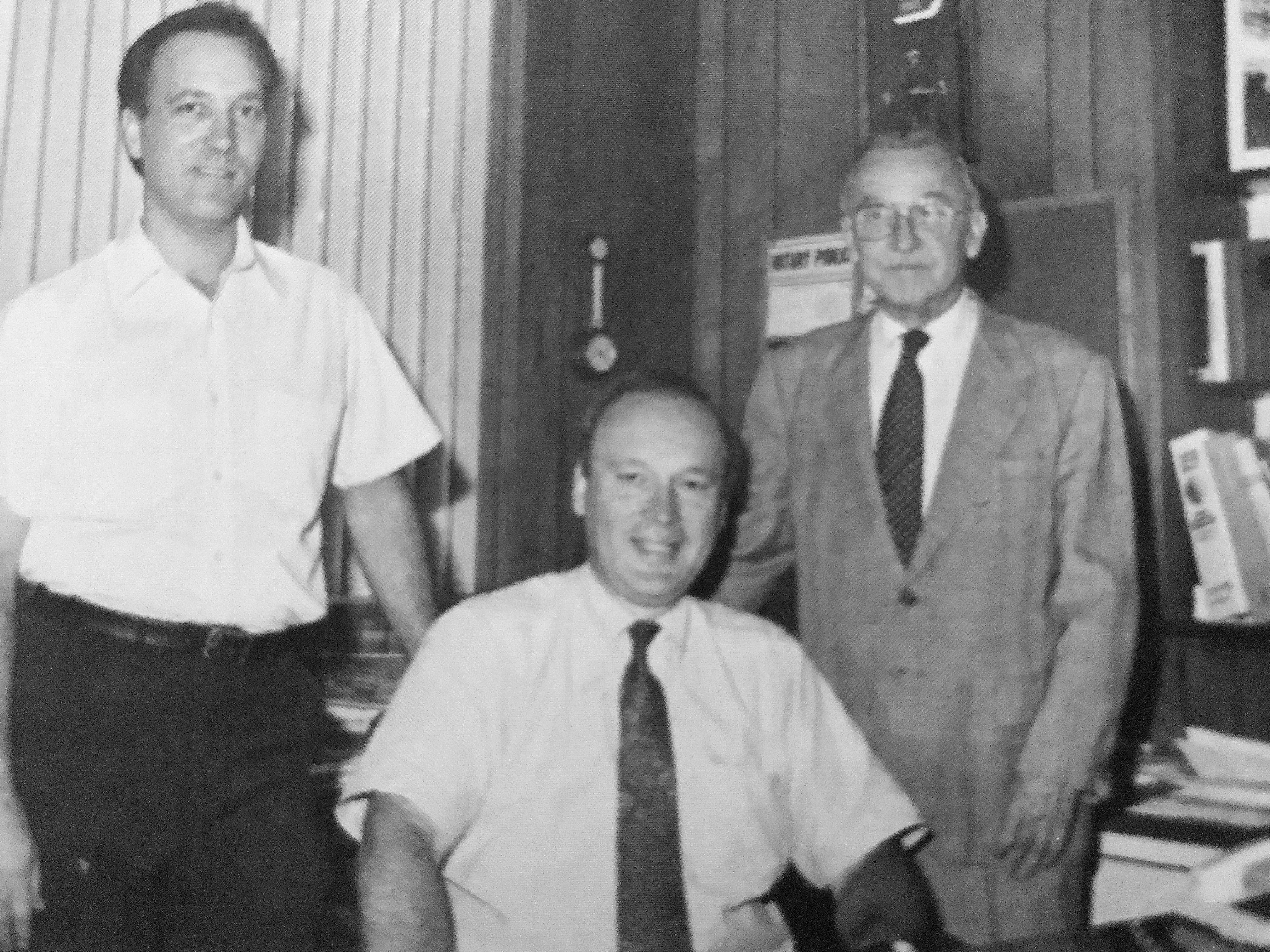
1990 Left to Right: Ken Kirkman, Vice President; Bob Kirkman, President; and Ernest Kirkman, retired Founder of Kirks Automotive now KIRKS.
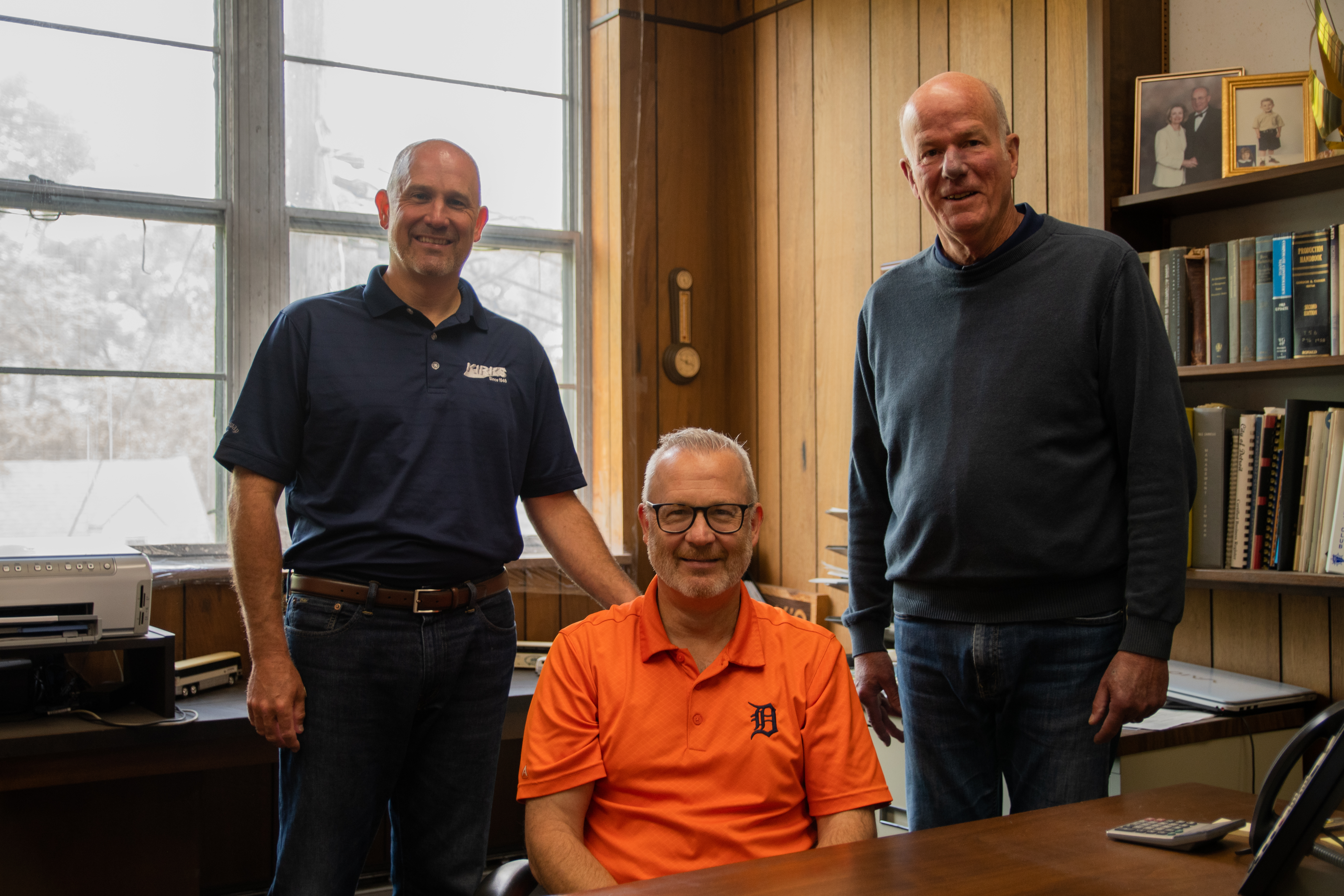
2021 Left to Right: Mike Kirkman, Co-President; Bob Kirkman, Co-President; and Al Benish, Vice President of Sales.
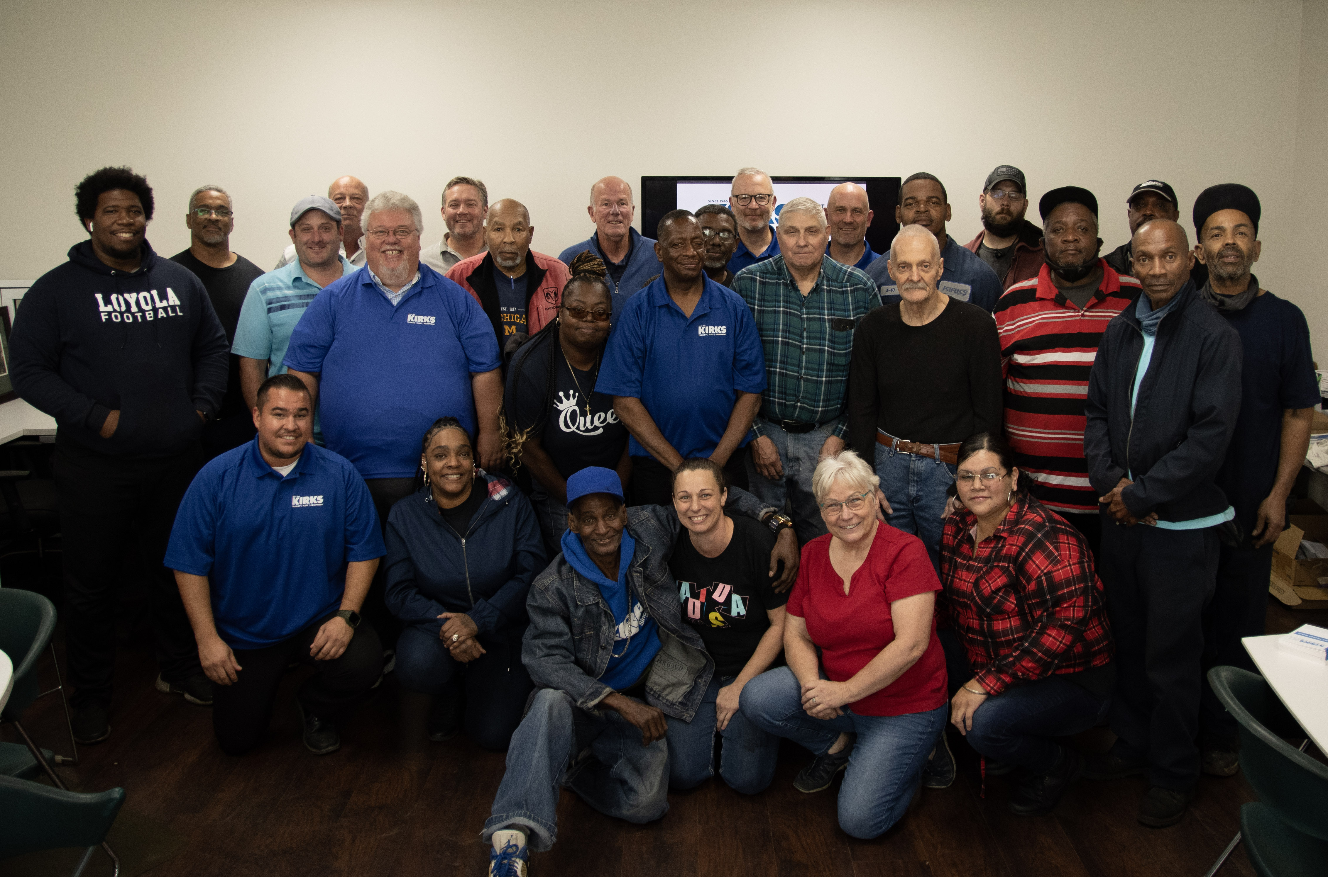
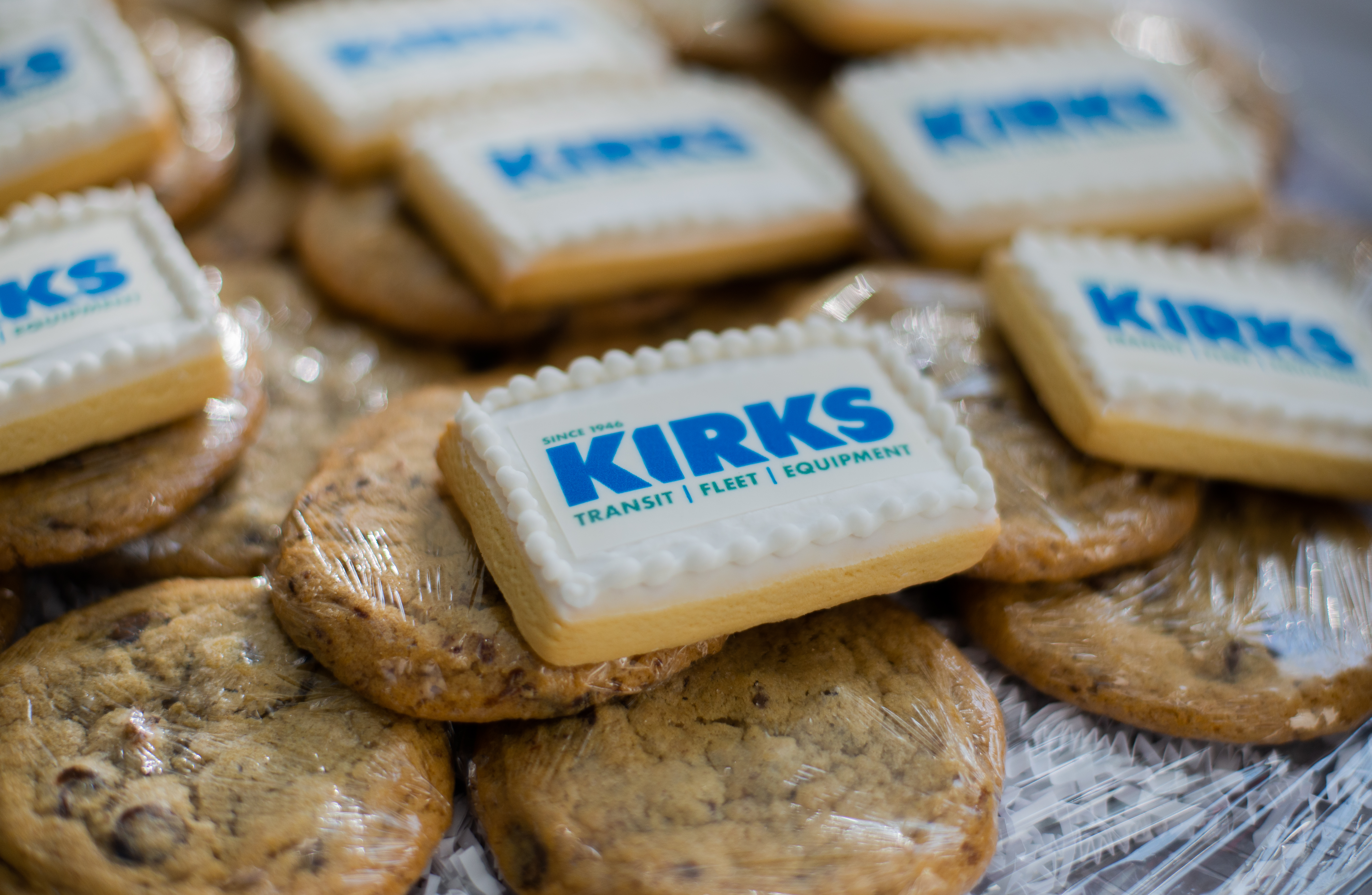
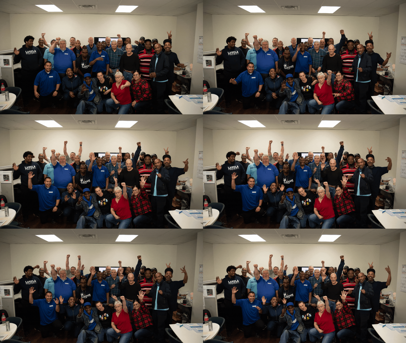
Internal Launch Party
Planning a rebranding launch must always include an internal launch with the company employees. They need to be ready and on message when it’s launched to the world.
For the visiting branding team from Identity Creative, it was rewarding to hear the stories from team members who have been with KIRKS for decades, share their stories about why they work for KIRKS.
Many enjoy the thrill of learning and taking the initiative to solve customers’ problems. Overwhelmingly, the stories had a consistent theme: the leaders care and people are treated like family.
RESULT:
KIRKS is positioned to compete in the national marketplace with a clear message and iconic brand.
Everyone on the KIRKS team–from the engineers, sales team, and technicians, to the crew in shipping, customer service, and delivery–is on the same page. With clarity and commitment to their shared purpose, mission, vision, and core values, KIRKS’ healthy culture is strengthened to adapt and grow with every change.
Their fresh website, expanded marketing collateral, monthly email newsletter, new look on the building and vehicles has quickly made a positive impact on sales.
“Identity Creative is an extension of our company, an arm of the company. You know our company and are our marketing department. We appreciate how you take the initiative to generate ideas and get things done.”

