You can’t always control your location at a trade show, but you can control how you get noticed. Whether you’re exhibiting at a show of 300 or 3,000, your exhibit can achieve stopping power!
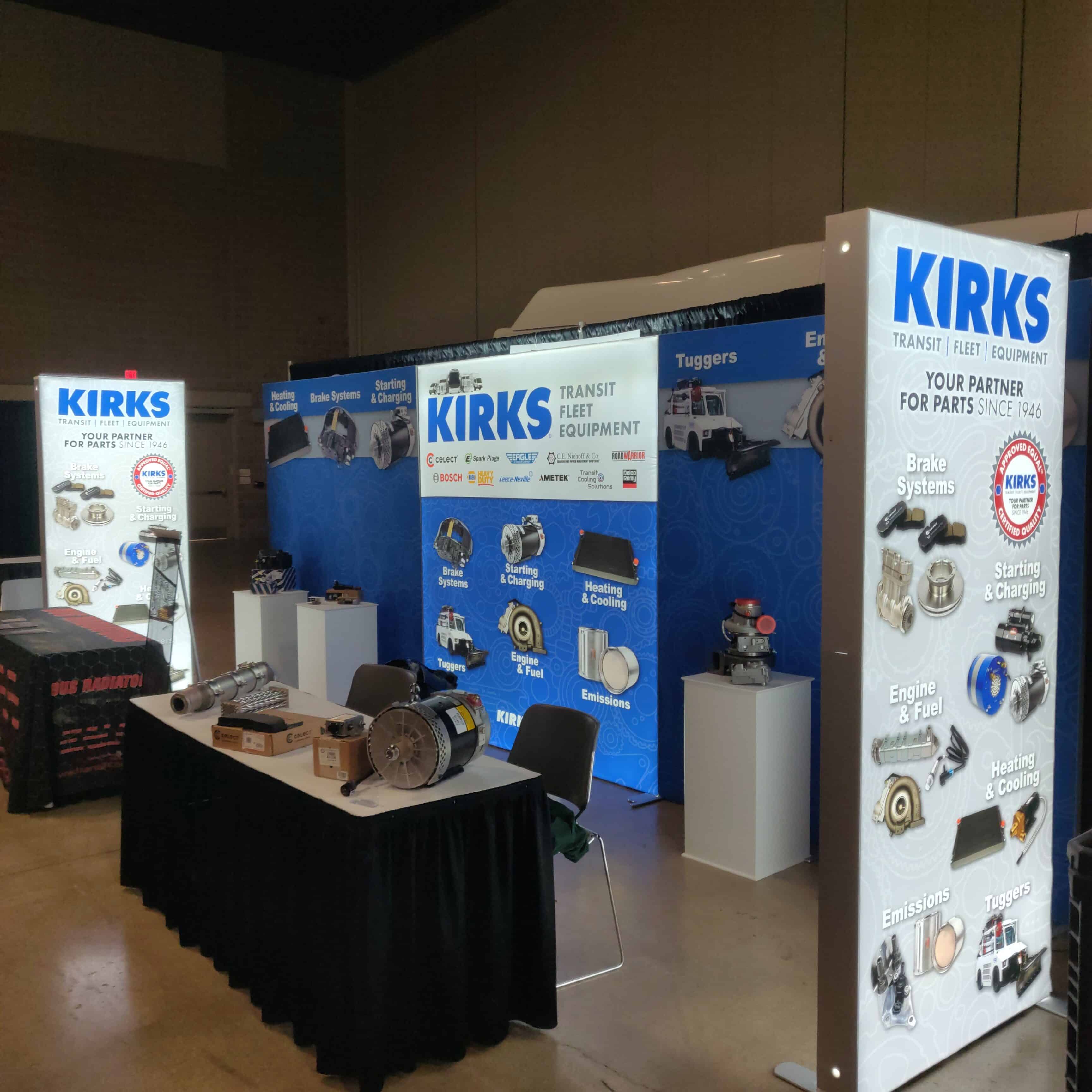
In the example below, the KIRKS sales team worked with us to create an exhibit display that pulls in prospective customers with fewer words and more impactful images. Bob Kirkman oversees the sales team and knows that KIRKS’ customers relate to visual images of the products.
In the way the products are displayed at the exhibit, KIRKS is doing more than attracting the people who buy them. They are also cross-selling. Bob told us, “People see these products, and they say, ‘I didn’t know you guys have these too!’”

Here’s how to achieve stopping power with your trade show exhibit:
7 Elements of a Trade Show Exhibit with Stopping and Sales Power
1. Psychology: Focus your design on what is most important to your customer: solving their problem and delivering success. Be very targeted and resist the temptation to say everything you do.
If possible, choosing a high-traffic location is ideal, as is quality. Only using retractable banners with an overhang light kit is a good, lower-cost solution, but is it time for your company to step up the look of your exhibit and ditch only using retractable banners?
2. Art: Clean design that catches their attention and makes them want to know more. Avoid busy graphics or not enough white space.
– Font size: If it’s important enough to be on your exhibit, ensure it’s readable: it should be at least 4 inches tall.
– Imagery: Use only high-resolution imagery. If your product images are blurry, hire a photographer for proper quality. You’re investing in your brand image. Strive for excellence!
– Hierarchy: What do you want people to see first, then second? Give careful attention to where people’s eyes will travel across your display.
– Positioning: In your design mock-up, place a to-scale silhouette of a six-foot-tall human so you can see what will not be visible when people crowd your booth (because you’ve expertly implemented these seven elements!).
3. Message: Use creative and compelling copy that supports the imagery.
Use no more than six words for your main header. Make your message clear so people don’t have to figure out what you do. Ideally, you want them to get the message without realizing they read it! It’s easy to spot an exhibit where the designer had been micro-managed by an engineer or salesperson: there’s too much copy because the boss wants to say it all.
If you’ve implemented the seven elements, people will be standing in front of your displays engaging with your team, not reading your backdrop.
4. Lighting: Be intentional about light’s subtle power to attract attention and create an inviting ambiance. Relying on the venue’s overhead lights is your biggest lighting mistake.
Many lighting options are available. Carefully consider lighting your backdrops, products, and interactive displays directly or internally. Well-placed lighting will level up your presence and the impression of your brand.
5. Marketing: Draw attention and create interest. Do you have an interactive display option? One of our clients recently decided to go to great trouble to bring a robot that hands out candy. Robotic integration is part of what they do, so it fits and will certainly draw people!
Be very thoughtful about the branded promotional items you set out for people. Meet with a promotional product specialist who attends the annual shows and has a grasp on the myriad of products available.
Take this opportunity to give a prospect something they’ll use that is related to your service or benefit. A good example is a freight company’s branded portable luggage scale with the message, “Weigh it right and $AVE!”
6. Sales: Relationships are built and strengthened, so make room for people and interaction at your exhibit! Buy as much space as your budget allows. Too many exhibits place a table along the aisle, and the sales team stays on the inside, creating a barrier between prospects and the sales team. Create an open area that welcomes people in!
7. Connection and Follow-up: Capture the contact information of quality leads. Drawings for giveaway prizes are an easy way to collect contact information. Be thoughtful about your giveaway, so you’re attracting prospects, not simply people who just want your prize because they like the restaurant gift card or the Yeti cooler.
Think of something that your prospect would find valuable. For example, if you’re selling software as a service, create a giveaway drawing of free credits.
Be ready with an email to send within 48 hours of the show. Ideally, you’ve got a CRM and email marketing system in place to automate your follow-up. By the time you’re back from the show, they’ve received a personal email from you, and you’ve lined up a phone call or in-person meeting.
Trade shows are gatherings of people who share an interest in your industry. They’re ideal places to make connections! Use your trade show budget wisely and creatively with these seven elements to leverage stopping power, attract people, and build relationships that lead to sales.


