Celebrating 50 years is the perfect time to refresh an event logo.
The Makeover Story
Last year, the Troy Community Foundation (TCF) took over hosting the annual Troy, Michigan festival, Troy Family Daze. This volunteer-managed event is a highlight of the year for many Troy residents and people from neighboring communities.
The Problem
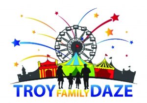
The previous Troy Family Daze logo was too detailed. It did not read well on event signage, promotions, and T-shirts.
Single color versions could not be used because of overlapping elements. The TCF wanted to celebrate the 50th anniversary of the festival with a fresh and meaningful Troy Family Daze brand identity.
A Winning Solution
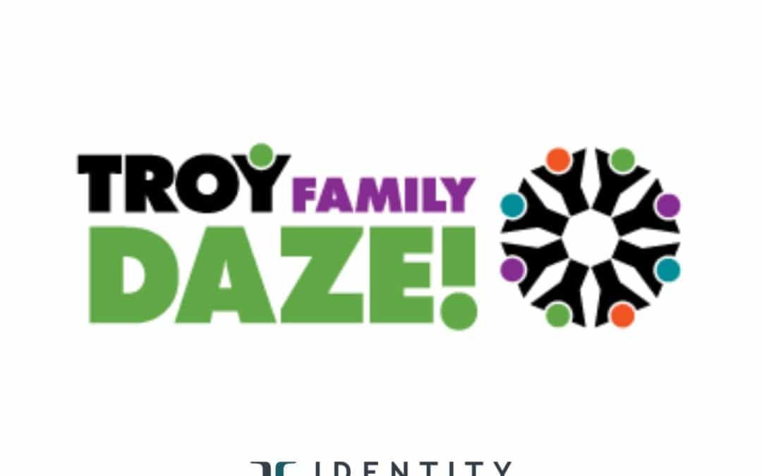
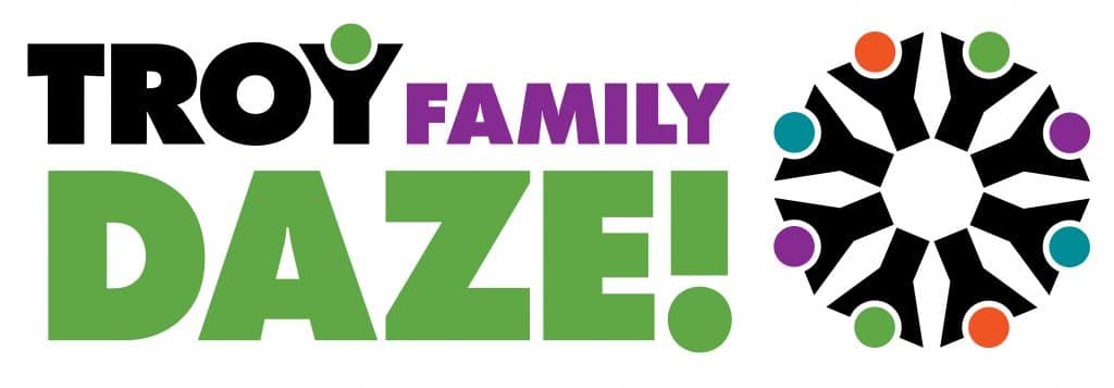
We focused on the concept of bringing a diverse community together for celebration and fun. The Ferris-wheel in the old logo was reinterpreted as a circle of people, united to create and enjoy this annual event.
The TCF is proud to celebrate the 50th anniversary of the Troy Family Daze Festival with a new bold and beautiful brand identity!
How important is an event logo? Like every logo, it needs to be readable in any media and in any size–when it’s both large on a billboard or small on an event ticket. It also needs to be memorable, just like you want your event to be.
In 2016, Identity Creative rebranded the TCF and worked to incorporate TCF brand elements into the festival’s event logo.
Do you know about the nonprofit heroes at the TCF?
Stop by the Troy Community Foundation’s site to see the good things that are happening there!
Check Out the Daze!
Every September, you can look for the signage in the city of Troy, Michigan. There’s something for everyone, so get all the details to attend this award-winning event at troyfamilydaze.org!

