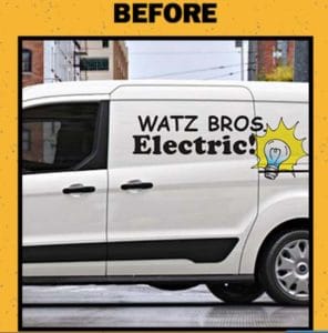
We recently ran across this Ford Truck Promo…YIKES!
Ford Truck is using the “Ugly Logo” as a promo for their latest line of trucks, AND they’re asking owners of Ford trucks to submit their ugly logo for a complimentary logo re-design opportunity.
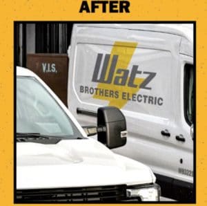
This is a good promotional idea–an out-of-the-box way to get attention because people love “before and afters.” However, I’ve been developing brand identities for over 25 years and I was stunned by their AFTER version — it’s not much better than the BEFORE!
From a professional standpoint, the ‘after’ example shows little – if any – improvement. At best, it’s simpler, but that’s it.
Here are three fundamental problems with the design:
- The lighting bolt is the 2nd oldest graphic in the electricians logo “book,” next to the “happy light bulb.” It lacks any originality, distinctiveness, or creativity.
- Misaligned text and graphic elements further pulls it off the road, and head-on into the ‘bad logo’ telephone pole. This would be a ‘before trophy’ in our book!
- Finally, and very importantly, the graphic design is layered behind the name. Try producing this logo in black and white, or in a single-color reproduction. These are implementation tests that every logo will face.
So Ford is promoting their new trucks–to people who already own one. However, I would caution any business, serious about its corporate identity, to solicit Ford Motor Company to recreate a new one. Their trucks may be “Built Tough,” but if they build you a logo, it may be Built Ford Fluff.

