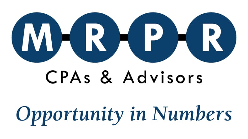
MRPR After
The partners at MRPR didn’t remember where their 30-something year-old logo had originated nor what it meant. Before re-branding, partner, Angela Mastroionni, CPA, said, “People ask us what our logo means and we have to tell them that we don’t know!”
MRPR brought in Identity Graphic Design and worked collaboratively to define and design the MRPR brand. The new logo and slogan captures their unique benefits and their mission.
The logo is a word mark, symbolic of an abacus and counting in its simplest terms and represents the people who connect to when in relationship to one another.
The MRPR partners have designed an effective way to optimally serve their clients by bringing together the individual areas of expertise of each partner for each client. Symbolically, the connected circles form a solid team. The MRPR partners do not work in silos and their clients reap the benefits.
The MRPR Identity: People at the center of the numbers.
The MRPR brand identity is a unique wordmark comprised of the four MRPR initials (the founders of the firm) inside the four connected circles: both represent numbers on an abacus, as well as individual people. The inter-connectedness of the four circles communicates the nature of the accountants’ work, the cohesiveness with which MRPR functions within their team and the stability of the firm’s forty years of client satisfaction.
One of the challenges that faced the MRPR team was that people would commonly pronounce the firm’s name as Mr. PR. The solid presence of each letter within a connected circle reinforces the correct, confident pronunciation of M.R.P.R.
This wordmark uniquely captures the solidity, proficiency and the personal engagement of the team that stands at the heart of the MRPR brand.
Click to learn more about this unique firm.


