Your logo is the face of your business – it’s your company’s identity. It’s the anchor of all your marketing. The face of your brand should be built for success. Our clients consistently prove to be discriminating business owners. Details matter to them. So does building on a solid foundation.
Today, I’m discussing the 3rd and 4th pillars in the Building A Great Logo series. If you get these two wrong (and I’ve seen national companies do it!) you’ll have a long-term marketing handicap.
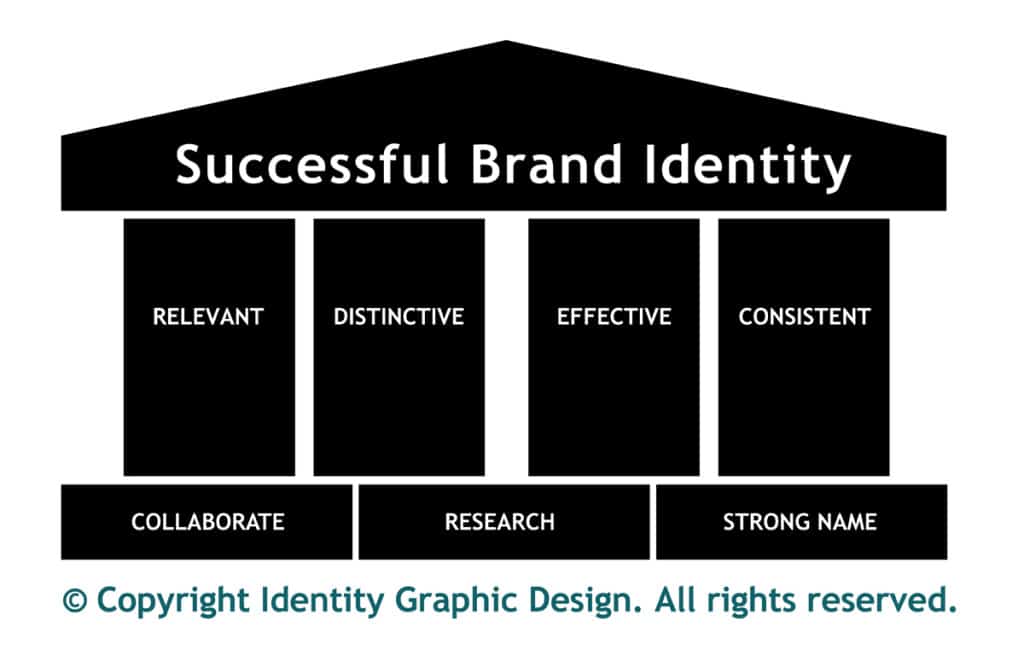
In previous posts, we covered the pillars of a great logo: Distinctiveness and Relevance. In this post, I’m covering the third and fourth pillars: effectiveness and consistency.
Effectiveness means that the trademark works everywhere it’s supposed to. In order for a trademark to be effective, it must be simple and adaptable.
Simple means not complicated. Too many designers feel compelled to create detailed artwork riddled with thin lines, dot screens, drop-shadows and gradients. These are mini-illustrations and don’t reproduce well in various media.
Too many details in a trademark cause image degradation when it’s reduced in size, copied or faxed. A successful company trademark should reduce to the size of a matchbook, or be enlarged to the size of a water tower and still remain impactful.
Effectiveness also means that it’s adaptable to a variety of media, contexts, and platforms. An effective trademark should be created in such a way that it will look good in black and white or full color. It should embroider or silk-screen well and look great on stationery, a sign, a website, or cut into vinyl and applied to a truck. It should look perfect. Everywhere. Which leads me to the next pillar of a strong logo.
The fourth pillar is consistency. Your company’s identity should look the same and be EVERYWHERE. Consistency will work when the logo is created effectively. A logo must be implemented consistently to maintain your brand identity. You’re wasting your money promoting your message if it is not attached to your business: I’ve seen direct mail pieces circular ads where I can’t find the company name.
Imagine this scenario: a sign shop is commissioned to make a sign for a Target store in the national retail chain. Their logo is two circles in a red, target-like symbol. Suppose the graphic designer at the sign shop decides to squish the red circles into ovals to fit into a rectangular sign. Is the corporate office going to be OK with a logo that looks like a ripple in a pond? Not on your life.
Absurd? Believe me, things like this and stories too gruesome to mention happen at logo slaughterhouses like quick-sign shops all the time!
Details like the spacing of logo elements, font styles, white space allowance, and colors need to be consistently reproduced. Every serious business has rules of use for their logo. In our industry, this “rule book” is referred to as a Corporate Identity Standards Guide. It’s an excellent tool for anyone responsible for reproducing a logo.
Remember, consistency yields familiarity, if it makes the right impact, it makes you memorable. When a customer is ready to buy, you want them to remember your service or product!
If these four pillars – distinctiveness, relevance, effectiveness, and consistency – are working together in concert, they will yield a memorable logo. The objective is to build credibility and be remembered.
Consumers make purchasing decisions on both an emotional and rational level. A professionally designed corporate identity which is distinctive, relevant, effective, and consistent will ultimately lead to customer awareness, confidence and increased sales.


Trackbacks/Pingbacks