What do you often see on a dental office sign?
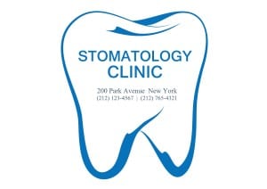
You got it! A giant tooth — with exposed roots.
There are (at least) three things wrong with that…
- It’s not unique.
- It doesn’t make the practice memorable.
- It tells you that teeth come out here by the roots.
We’re not in the 16th century where we have a largely illiterate populace that can’t read and are familiar with seeing teeth fall out by the root!
Dentists are experts in oral care – not branding – and often turn to speedy printers or quick sign shops for their branding. As a result, they end up with a graphic element, not a brand identity. Typically, every industry has a graphic to which graphic artists tend to default and, no doubt, the TOOTH is the common symbol ‘drive-by branders’ unfortunately use. There are signs, in recent years that people are getting a clue as more of these toothy icons are being replaced with smiles.
The goal of dental branding is the benefit one receives from the dental care, not merely to communicate the subject of teeth. People already understand what a dentist does. At Identity Creative, our goal is to help each dentist we serve, shine in their own unique way.
So come on world! Let’s spread the word and tell the dental profession to have their designers ‘bite-it’ when it comes to toothy logos!
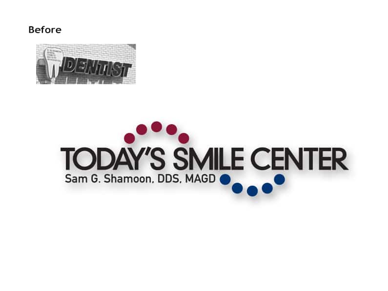
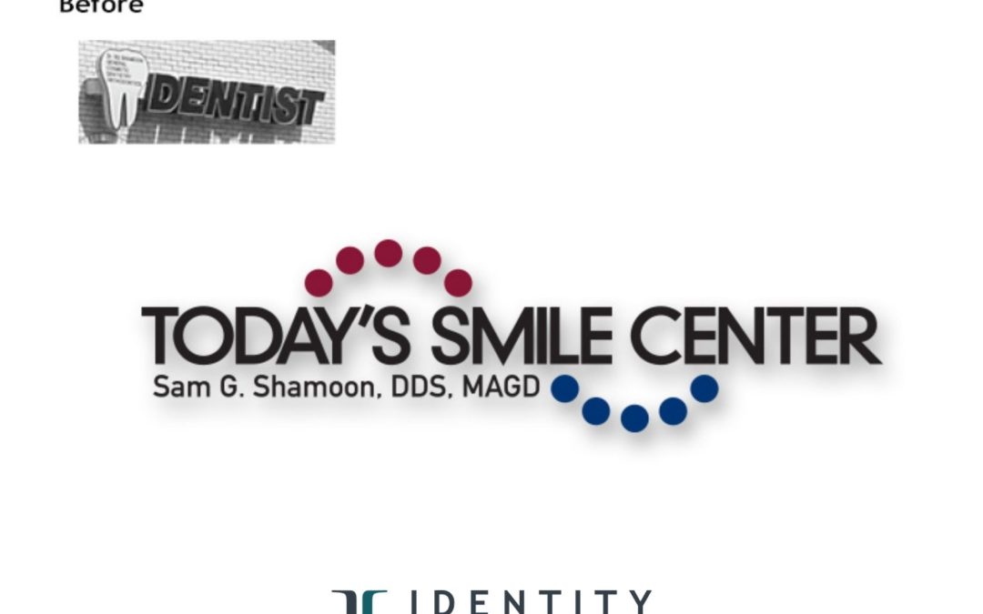
Below, Dr. Shamoon of Today’s Smile Center in Berkley, MI, trusted Identity Creative to give his brand identity a remarkable transformation:

Now, if you’d like to meet a great dentist and his team, click here!


