Your logo is the face of your business.
Q: Can your logo truly impact your customer’s experience and purchasing decisions? Could your company’s logo be negatively weighing on talent acquisition and retention?
A: Yes, and yes.
Like seeing the face of someone you know, seeing a company’s logo immediately identifies the business.
The Research
Graphic design has the power to influence thought and inspire action. For over a decade, we have been showing before-and-after logos of brand makeovers in business presentations across the country. Consistently, from hundreds of people, we receive the same feedback: people will make a buying decision simply based on their logo.
When we ask, “If you needed to hire a painter to have your office painted—and the only information you had was the face of their business (their logo), who would you hire?
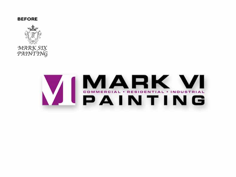
With only a couple of seconds to view both logos, overwhelmingly, people choose number two. When asked why people give their reasons:
- “They look like they know what they are doing.”
- “I have confidence that they can get the job done well.”
- “The first company probably has rusted trucks, and I don’t want those in my parking lot!”
- “They likely cost more, but you get what you pay for, so I’d go with number 2.”
Another interesting discovery: people overwhelmingly assume that Company A is a single painter and Company B is a professional team. (This is a before-and-after makeover of the same company.) Design has the power to influence purchasing decisions.
As small businesses, we don’t have the deep marketing pockets the big guys have, and we need every impression to count. It must be a priority to make that recognition positive and make a great first impression!
Customer experience is taking center stage.
We are likely seeing the start of a massive shift from focusing on marketing our businesses (marketing is getting our message out there) to creating a better—outstanding—customer experience. Think, Customer Reviews.
With the talent crunch in the marketplace, are you creating a culture and brand image that attracts talent? To attract and keep talent, we need first to be a place where someone is proud to work. (They’re more likely to wear your logo if it looks cool on your merch, too!)
Everything about your brand, from the first impression to the quality of your product and the way it’s delivered, impacts the customer experience.
Do you need a new logo? Has your team been talking about a brand refresh? What is the difference between a “brand refresh” and “rebranding?”
Defining terms: Brand Refresh vs. Rebranding
Brand Refresh – def. noun
Your company has a solid brand strategy, and your logo has good bones, but it needs to be cleaned up. Perhaps it has an older, stodgy font, or too many details.
Rebrand – def. noun
When there have been significant changes in your business, you want the world to see the positive changes and the face of the business needs to reflect this. Another reason is when you have a company running without a brand strategy or has no clear message. Bill goes into more depth on this topic here, watch 5 Key Indicators It’s Time to Rebrand https://www.youtube.com/watch?v=E3ykch87LwQ
Keep in mind that rebranding your business is a big deal, and too much is at stake to do it on a whim. Watch 4 Red Flags When NOT to Rebrand https://www.youtube.com/watch?v=gKoDW3EG5s0 and avoid getting stuck within lame rebrand.
Does your business need to look in the “logo mirror”?
Is poor design negatively impacting your brand? Here are our top 5 signs of an inferior logo (with comments we’ve heard from marketing directors):
1. Your logo is outdated.
“Our logo looks OLD, not retro, just old.”
When was your logo created? If it was from the marketing era when a full-page Yellow Pages ad meant you were dominating your competition, it’s time to re-evaluate.
An iconic logo can last decades. Is your logo truly iconic, or does it look dated?
2. The logo has an amateurish feel.
“Someone told our CEO that our logo looks unprofessional. Now she sees what the rest of us have known for a long time.”
There are tell-tale signs that an amateur did your logo. Even a talented graphic designer who isn’t trained in brand identity can make glaring mistakes.
Design in the marketplace has become increasingly sophisticated. There is a higher standard that our customers have come to expect.
3. The logo doesn’t reproduce well in various media.
“It’s really a pain to get our logo to look good on a shirt, a pen, or even a door!”
Do you find that you have to make design decisions every time you order a promotional item with your logo? Has someone ever told you that they need to “tweak” your logo to place it on a single-color background because it won’t work the way it is was designed?
This will happen when there is too much information in your design, especially drop shadows, small lines, gradients, and overlapping colors.
A logo visually represents your brand, and it needs to show up consistently and flawlessly in every media. Don’t let anyone alter it for any reason, ever. Making even slight design alterations is defacing your brand identity.
4. The logo is used inconsistently.
“Our logo looks different everywhere.”
Consistency builds trust. If your customer doesn’t trust you, you don’t have a sale.
“Trust is the ultimate shortcut to a buying decision and the bedrock of modern branding.” – Marty Neumeier, The Brand Gap
From a small startup to an international giant, every business must have logo files in horizontal and vertical orientations, black & white, knock-out, and various raster and vector file formats needed for any application.
A Logo Standards Guide, or Brand Style Guide, is the design rule book for the brand. It makes decisions for how the logo will be used in various media, color formulas, font styles, and more.
When it is adhered to by employees and vendors, it will build the kind of credibility that leads to growth. Sloppy or unused brand standards slowly ebb away at your brand’s credibility. This is a frighteningly costly mistake.
5. Employees are not excited to wear the company’s branded wearables.
“We have a storage closet full of hats and jackets that no one wants because our logo is embarrassing.”
This was the complaint of a marketing director who brought us in to overhaul their brand identity.
Attracting talent and having employees who share a passion for their work will be supported by having a logo that they are proud to wear. Businesses win with a clean, compelling logo and stand for something meaningful.
An inferior logo is hurting the credibility of your business. Does your logo communicate the strength and professional image your company deserves? Does it communicate meaning that supports the unique value your business brings to your team and your customers?
Bill discusses the glaring design flaws commonly made in brand identity—logo—design below.
Rebranding with a refreshed or new logo builds momentum.
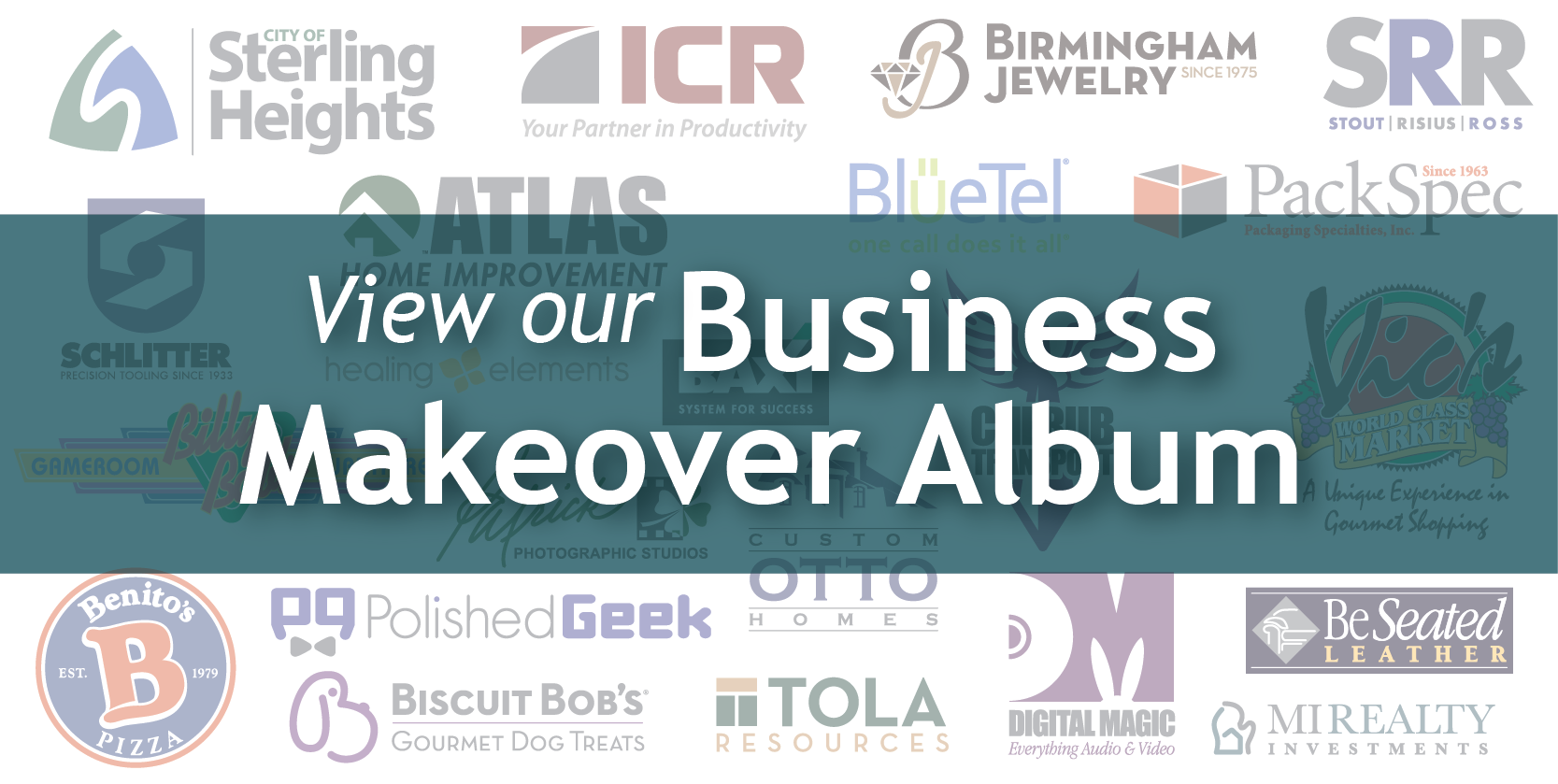
“The new logo made a complete, total, 180 degree change in how our product impacted people’s buying decision. It’s actually a motivational logo, something I didn’t think I’d ever find, but we did!” – Bob King, Founder, Biscuit Bob’s. Read about it here.
A professionally executed design will positively impact multiple levels of your business. If you’re not sure your company is up for a rebranding, watch 5 Key Indicators It’s Time to Rebrand. Don’t risk the potential to lose credibility with a poorly designed logo.
Take the Logo Challenge Here
If you’re not sure, take the Logo Challenge. If your leadership team isn’t in agreement on whether it’s time to rebrand and update the company’s brand identity, share the Logo Challenge with them.
Be confident about your brand. It’s the face of your business. Let it shine!

