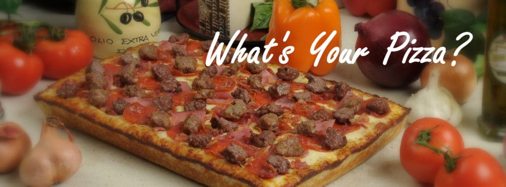
Jason Mautone and his brothers operate the pizza franchise their father, Benito, started in Belleville, MI in 1979. It has grown with franchisees into more than 20 stores. Today, the original round and deep dish dough recipe is used, along with specialty sauces for each kind of pizza pie.
During one brand discovery interview, Jason told us about growing up in the Mautone family and of the trips to visit family in Italy. At one point he closed his eyes, traveled back in his memory, and said, “The flavors…the olive oil and fresh sauces. There’s nothing like it!” That passion for flavor is carried through every menu item Benito’s creates, with superior ingredients for their sauces, salad dressings, cheeses & pastas.
When we asked Jason what he loved most about this business, he answered: “It’s doing something you believe you’re the best at. I wouldn’t be doing this if I didn’t think we were the best. I was taught to care about what I serve to people. I was taught never to sacrifice quality to make more money or make it easier. There’s a lot of frustrations in the pizza business, but when a customer comes up to the counter and tells you that your pizza is great, or how far they come to get Benito’s, it energizes me & keeps me going. When people ask me what’s our best pizza, I honestly tell them, ALL of them!”
So why did Benito’s Pizza, with its loyal fans and great reputation, decide to update their logo?

CHERRY WALNUT SALAD ~ Fresh Mixed Greens, Red Onions, Dried Cherries, Walnuts and Fresh Goat Cheese. Served with our delicious, homemade Raspberry Vinaigrette Dressing!
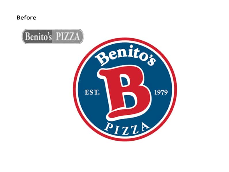
Jason, positioning the company for growth, saw issues with the old logo with its limited horizontal orientation. “We have a big square pizza box, and the logo is long and narrow. I envision a logo that has a circular symbol that will cover the box.” Adding to the frustrations of an old logo that was created without corporate standards, each new store presented challenges with signage requirements and other applications that used the Benito’s brand identity.
Identity Creative worked through concepts that included a smiling “B” and a hungry, pizza-eating “B.” The Benito’s leadership team settled on a soft, angled “B” that reflected the fresh dough in a playful way. We updated the colors and provided vertical and horizontal orientations, as well as a standards guide and their logo in every file format that they will ever need for future use to maintain brand identity consistency.
For the Identity Creative team, every on-site meeting offered us an opportunity to sink our hungry teeth into their fluffy & crispy deep dish and to take-out a massive Big Benito to share with the gang. Have you tried Benito’s Pizza? Tell us why you love it in a comment below!


