Four reasons the new Hershey’s logo works

When news of a company’s re-branding hits the wire, it’s in vogue to find some fault or phallic symbol in the new logo. Some people won’t miss an opportunity to mock a logo as evidenced by the flurry of internet postings comparing the new Hershey logo’s Kiss to a friendly, excrement-like Emoji. Sometimes it’s deserved, but often, the critics are quick to jump in with little information about the process it took to get there. Taking a shape to its simplest form—and still capturing the qualities listed below requires discipline and creativity. To visually communicate an entire brand in the logo is not a simple task!
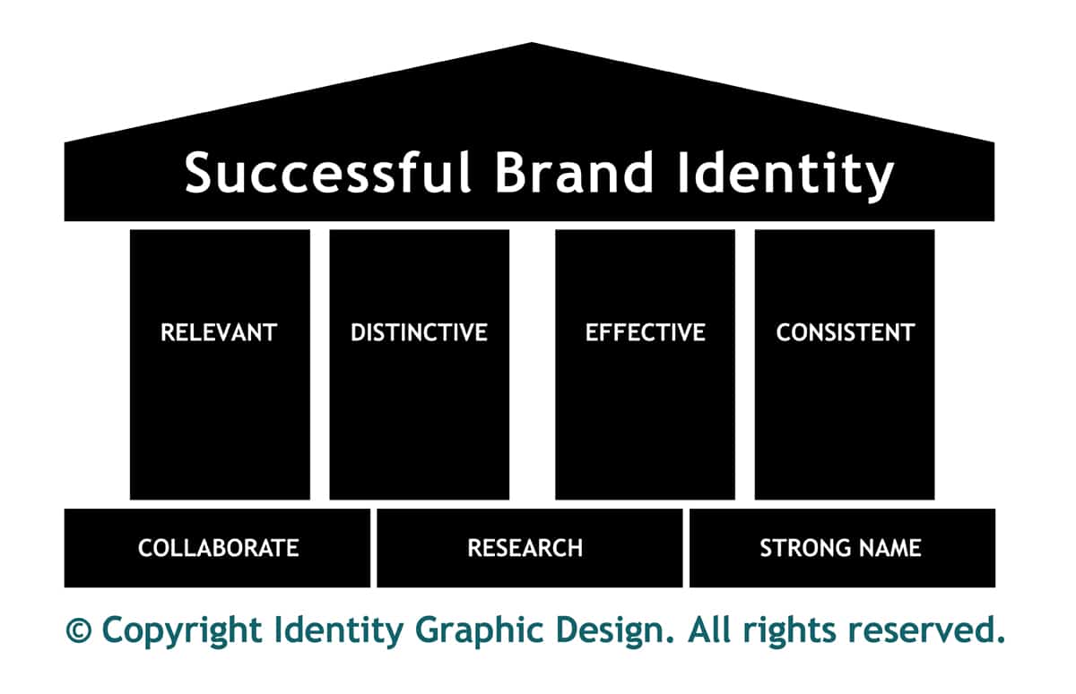
The Hershey’s rebrand met the four principles that we use to qualify a good mark.
Four Pillars of a Good Logo
Distinctive. It’s unique. Differentiate from competitors.
• Created specifically for unique product/service you provide.
• You are the only one who looks like you.
Hershey’s owns the Kiss.
Relevant. It’s meaningful. It communicates meaning and benefits.
• It is NOT random symbols or clip art.
• Essence of business’ past, present & future
The Kiss has demonstrated adaptability and longevity. It’s a perfect symbol
Effective. It’s memorable for the right reasons! Creates a positive impression or memory
• Creates customer recall
• Reinforces a relationship.
The Kiss is so simple and iconic; it’s a strong symbol for memorability. The symbol builds on the relationship people have with the brand.
Consistent. It does what it’s supposed to do—everywhere, every time.
• aesthetically pleasing – simple vs. busy
• it is scalable and it works in B/W – NOT amateur design-symbol with gratuitous use of gradients and drop shadows
• balanced –symmetrically or asymmetrically
• long-standing (not quickly dated)—use of color has relevance and supports the message
The logo must be used consistently. It is the company’s identity and the foundation of everything visual. The shape of the iconic Kiss can be reduced, is simple, recognizable and clearly has longevity.
Would we have wanted to take our turn at the design table? Yes. It would have been fun to explore a word mark with the “y” and create a unique subline rather than the redundant “The Hershey Company.” Did they need to remove the wrapper? Could they have designed a cool silver swirl?
Ultimately, it comes back to the customer. What is the direction the design team is given? The parameters of the project establish limits. No doubt the new Hershey logo was run through various focus groups. If someone did see an emoji, the design team and the company didn’t think it was enough to scrap the icon.
Call it what you will. If your brain takes you there, so be it. It’s certainly creating a good media blitz for Hershey’s. The Kiss symbol is elegant. The paper waves as a flag, with a gentle, yet strong movement. It works.
Visit Brand New to see examples of Hershey’s custom font and the new visual identity system.


