
MRPR CPAs & Advisors

The Branding Challenge
The leadership team at MRPR wanted to update its brand identity with a fresh and relevant look. No one at this reputable accounting firm knew what was originally intended with its old logo design. If they could solve the problem of people mispronouncing the name of the firm as “Mr. PR,” that would be a major bonus.
The company needed a professional rebranding that included a deep dive into its culture and the value that it brought to its clients.
Attracting talent was another challenge. The MRPR team had worked diligently to build and maintain a vibrant, healthy, company culture, but their look and message were failing to communicate it.
Almost 40!
MRPR Group, P.C. was on the eve of their 40th year anniversary. “It was during this past year of significant focus on our strategic plan and vision for the Firm’s future that we decided it was time for change,” says Greg Zink, Principal at MRPR.
In our first meeting with the executive team, Angela Mastroionni, Principal, said when people asked about the meaning or symbolism of the old logo, they had no answer to give! No one remembered who designed it and why.
Representing a vibrant culture through branding.
As CPAs and accountants, the MRPR team is creative, innovative and deliberate about building and strengthening a vibrant company culture. They deserved a logo to help them represent them in a unique way.
Expand the sections below to walk through MRPR’s Rebranding Process, from discovery to their anniversary launch celebration.
Process: Defining the MRPR Brand
Working with Identity, MRPR spent several months reminiscing on the Firm’s history, its founders, its people, its clients and contacts and most importantly who they are and their purpose. During the Define Phase, we explored their history, differentiators, and vision: it became clear that MRPR has always built their firm and services with a focus on the well-being and growth people – both clients and employees.
“It was quite an involved process and we all felt strongly that our intent here was not to change who we are and not to change our culture, which for those of us who have been at the Firm for 15 plus years are very protective of. We also wanted something new & fresh that our young professionals could be proud of and relate their experiences to.”
– Angela Mastroionni, Principal
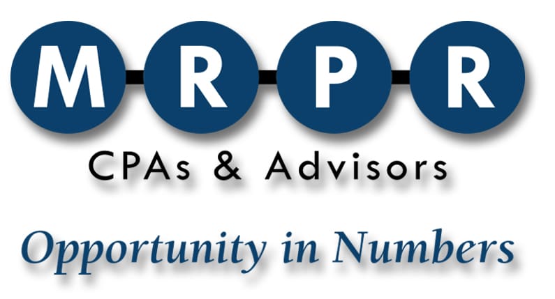
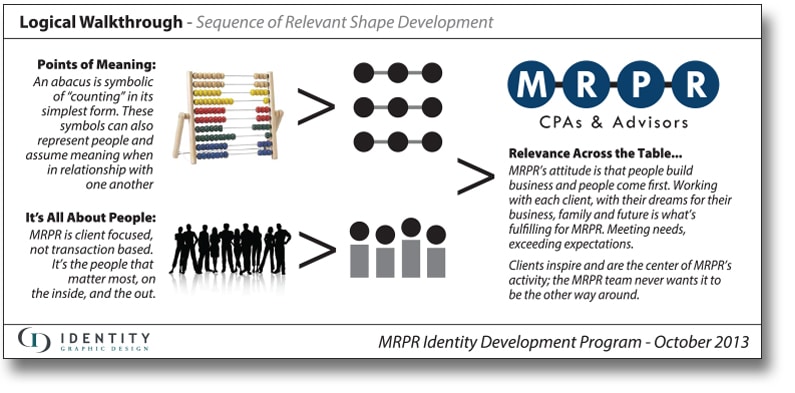
![]() By incorporating circles to represent connected people, in an abacus-like wordmark, we brought a playful uniqueness to their new brand identity. The wordmark also prompts a clear reading of the name, MRPR, solving the problem that was often encountered with the old logo when people would read it as “Mr.PR.”
By incorporating circles to represent connected people, in an abacus-like wordmark, we brought a playful uniqueness to their new brand identity. The wordmark also prompts a clear reading of the name, MRPR, solving the problem that was often encountered with the old logo when people would read it as “Mr.PR.”
When the MRPR team talks about a culture that cares about people, it was evident every step of the way. Throughout the rebranding process, the MRPR team considered how the rebranding will impact and be received by their clients and making certain they were including every member of their staff.
A Distinctive and Relevant Logo
“We have a unique culture at MRPR that we want to portray through this new visual identity – our focus on building relationships, connecting with others to enhance our clients’ successes and always remembering that people build business! And, with all that combined, there are endless opportunities for our team of professionals and our clients.”
– Greg Zink, Principal at MRPR
The logo is a wordmark, symbolic of an abacus and counting in its simplest terms and represents people who connect and work in relationship to one another. The circles are blue and the letters within represent, as before, the Firm’s founding partners and the other partners who made the Firm what it is today – (James) Mathews, (George) Reich, (Anthony) Perna and (Mark) Rottermond.
The new wordmark solves the annoying problem when people pronounced the Firm’s name as “Mr.PR.” The solid blue elements give each initial their own significance for clearer identification and an accurate identity.
“As accountants, we deal with numbers and people every day, but more than that, we communicate, collaborate & make connections for a greater purpose and the best results. The new brand tagline, ‘Opportunity in Numbers’ sums up the Firm’s promise to its clients and its people, that together there is tremendous opportunity to be had by all!”
– Steven Everson, Principal
The new brand identity program included an updated website, corporate stationery, marketing and sales materials.