
Biscuit Bob's
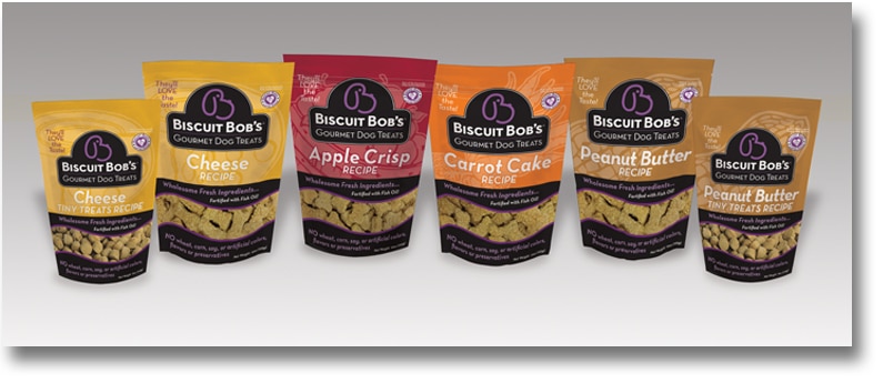
Biscuit Bob’s had a great product, but a “flea-market” image. By merging a dog-like look into the letter B, we were able to create a unique and memorable company and product trademark. This was then incorporated into new packaging and introduced at the SuperZoo in Las Vegas in July of 2013. Since then, sales have sky-rocketed.
An outstanding product & business sense wasn’t enough
Beauty Begins on the inside, but it can’t stop there!
Biscuit Bob’s Gourmet Dog Treats (BBGDT), once turned down by small, independent stores, is now being sought out by national retailers: what made the difference? Owners Bob & Lena King launched their new brand logo and packaging at a national trade show with over 1,500 vendors and they will confidently tell you, the power of branding takes a great product to greatness! Watch their story here.
Time and money wasted with inferior brand identity work
Before the re-branding, Lena and Bob were told by a distributor that the look of their packaging was hindering sales: packages were not moving off the shelves. So they set out to find the right design source. In an attempt to save money, they tried one of those designer-for-cheap-on-line sites only to find that the design quality was poor and, after add-ons, it was costing more than they’d expected. Starting a business is a difficult and time-consuming endeavor. Wasting time on ineffective branding not only equates to money lost, but is a drain on time and the energy so needed to launch a brand!
How can a logo misrepresent a brand?
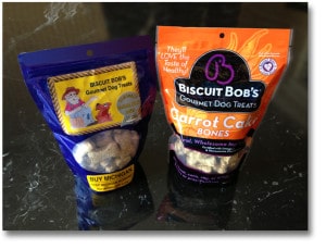 The old logo depicted a hillbilly-ish old man, in worn overalls, waving his hand toward a happy dog. The sketch (sketches and thin line drawings are inherently problematic as a logo element) had no relevance to the Kings or the potential for the brand.
Bob and Lena King aren’t old, nor are they hillbillies. They are very intelligent, highly-motivated and—above all—generous people who love dogs. The Kings lost a beloved pet due to the harmful ingredients found in commercial dog food. When they brought home their new puppy, they set out to create a healthy treat for her. Their recipes were such a hit with her and the dogs of family and friends, they decided to package them for others to enjoy with their dogs.
Defining the Biscuit Bob’s Brand
The biscuits were born out of the King’s love for their dog, Mila. Lena possesses outstanding culinary skills (you should try her rum cake!) and Bob is an engineer who considers researching commercial pet foods a hobby. BBGDT biscuits are a choice that smart people who care about healthy treats for their dog will want to purchase.
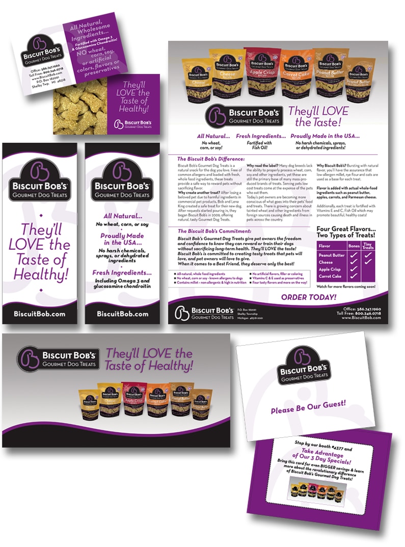
While working through the Brand Profile with Bob & Lena, the direction for their brand had begun to be clear. The kind of look and message of the Biscuit Bob logo needed to reflect was a simple commitment to high-quality ingredients, a sophisticated style for savvy shoppers and, above all, a love for dogs.
After working with Identity, Bob & Lena are thrilled with the new logo and the impact it–and the packaging–has made.
The new logo made a complete, total, 180 degree change and not only in how our product is presented to people. It’s almost a motivational logo, something I didn’t think I’d ever find, but we did!
One of the important branding lessons Bob and Lena learned is that people have to be drawn to your product BEFORE they will try it. Making the investment in a dynamic brand identity with the logo, sub-line, packaging and supportive marketing material made the difference for Biscuit Bob’s Gourmet Dog Treats. They truly are gourmet and now they look like it. The Kings are busier than ever working out distribution details and meeting requests for orders. Biscuit Bob’s Gourmet Dog Treats is a product truly created with love. Go ahead, read their label. Your dog will Love the Taste of Healthy!