Like making the perfect bake, rebranding requires the right ingredients, skill, and passion.
When rebranding with a new logo for a brand makeover, meaning makes it work.
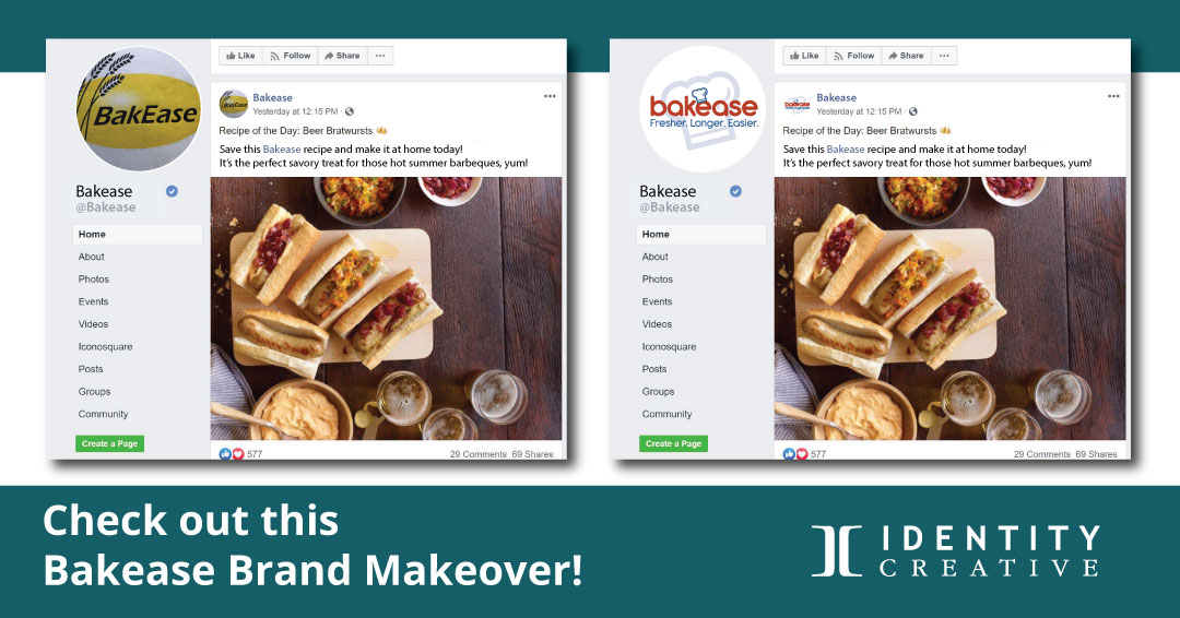
Which Facebook page looks like a national brand?
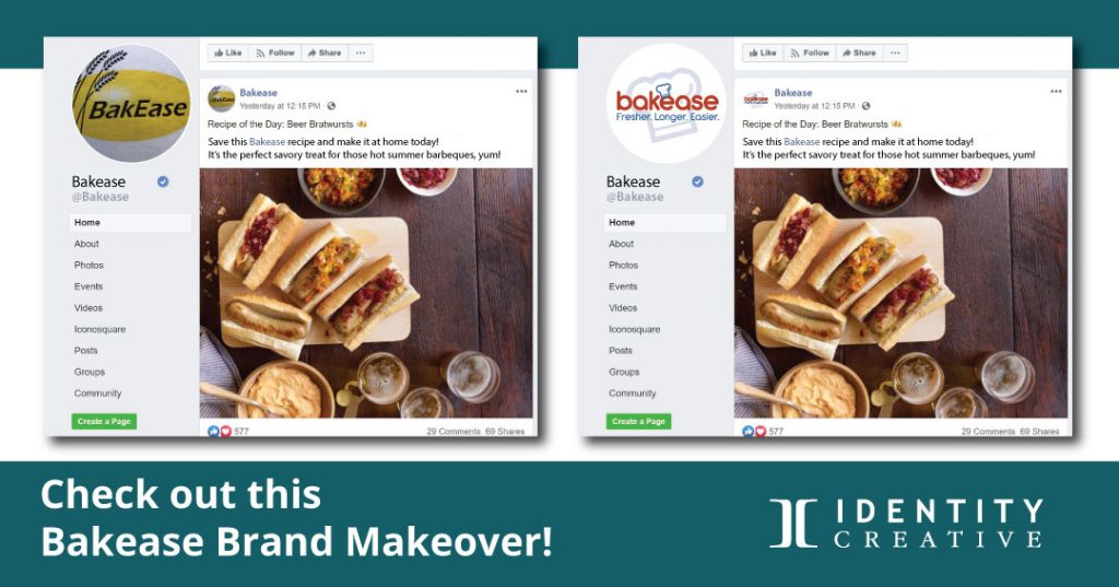
The Bakease “Before” Rebranding with a new Logo
When you’re rebranding with a new logo for a brand makeover, know what works and what won’t.
Three primary flaws in the “Before Rebranding” logo:
1. The name is often mispronounced.
2. Wheat Clipart doesn’t communicate the right message.
3. The yellow shape will cause a plethora of problems.
The Bakease “After Rebranding” Logo
Three Branding Solutions for the Logo
Here’s how we worked to creatively resolve these flaws and design a wordmark that meets our criteria for a successful brand identity: it has to meet these four principles, Distinctive, Relevant, Effective, and consistent.
1. The name, Bakease.
Every brand wants to be remembered when people are ready to buy. If they can’t pronounce the name, they’re not as likely to remember it. In our focus groups, 50% of respondents who looked at the “before logo” read the name wrong.
Bakease was the registered trademark, and the name wasn’t going to be changed, so we worked on designs that would help people read it as bake-ease. When we added the graphic element over the first “e.” and tested it in a focus group, we found almost 100% improvement in pronouncing the name correctly.
2. Design something unique and relevant.
The clipart wheat didn’t reflect what Bakease was bringing to the market. While the primary product is for baking with flour (wheat), it is more about improving quality and greater profitability for bakeries. Bakease is for bakers who desire to produce delicious and fresh delights for people to enjoy.
3. Lose all unnecessary information.
The shape behind the name hinders readability and causes problems with reproduction.
The gradient white-to-solid yellow serves no purpose and would necessitate decisions for years on whether to include it on silk-screened or embroidered promotional products. Gradients are impossible to embroider and challenging to reproduce consistently in print.
Go for a clean logo design.
If a logo doesn’t work in positive and negative space (black and white), decisions will have to be made throughout the life of the logo on how it can be altered to be reproduced in various media. Modifying your brand identity’s design is a formula for inconsistency: that is a major branding no-no.
Consistency in branding is critical. In the vertical Bakease logo below, the symbol can be lightly screened behind the name. Because the background image isn’t built into the design, it can be used for impact and to maintain consistent branding.
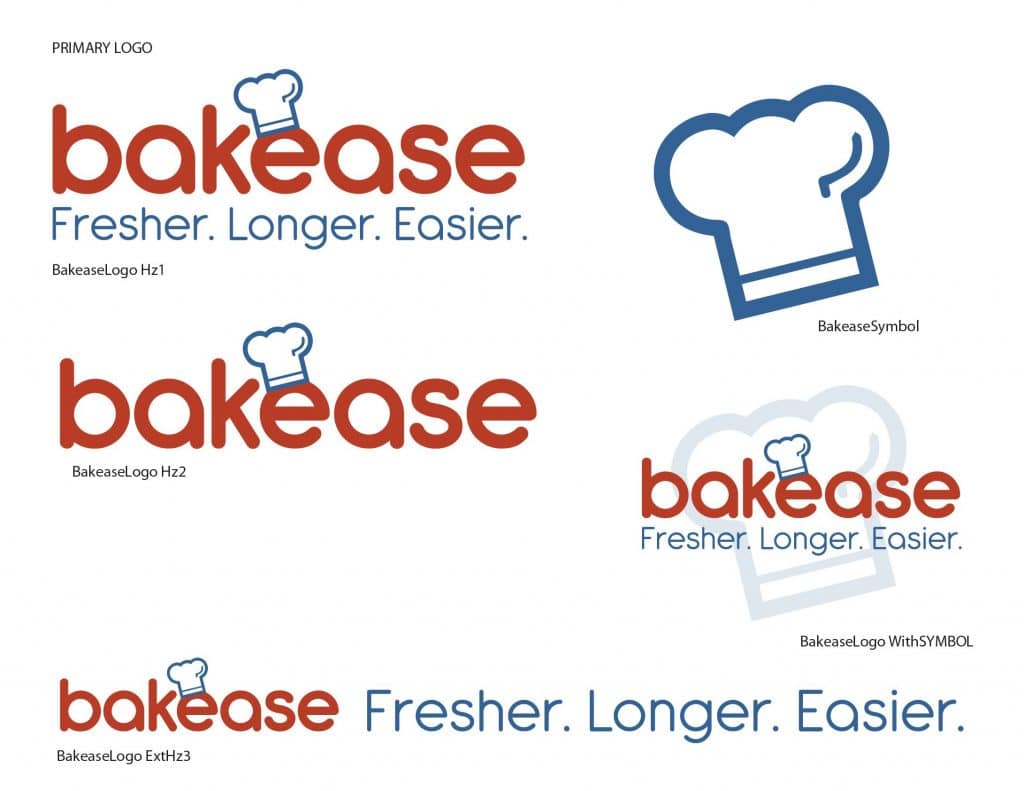
These logo examples in horizontal and vertical formats in the Bakease Brand identity Standards Guide, with and without the slogan, will provide the right fit for any media.
The symbol also works well as a social media profile image. Can you see the difference here with a clear, potent symbol in this side-by-side social media post comparison?

The Dream for Bakease
Bakease develops natural dough enhancers that provide several bakers with consistent quality in baked goods, easier production, and longer shelf-life.
Creating an iconic wordmark, a compelling slogan, and an easily repeatable phrase will help solidify Bakease as the independent and amateur baker’s trusted brand. When you’re rebranding with a new logo for a brand makeover, meaning makes a remarkable difference.

